Like many entries, I think this could use one more line specifically explaining it\'s photographic prints for sale -- don\'t think it would be clear or enticing enough to \"outsiders.\"
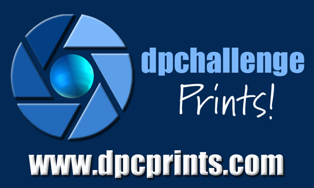
I like the blue that goes throughout this design. I's very eyepleasing. I think the 'Prints!' should be a little bolder, but thats just my opinion. I'm also not too keen on the bevel of the URL. The bevel on the logo looks good though.
Wow this could be the in the top few if: 1) the "Prints!" text should be the standard yellow logo and bigger. Then 2) extend the great graphic of the award to have the ribbons, but fadded down behind the url. Great one otherwise.





 Add photograph to your favorites
 Add photographer to your favorites


