First Impression: Good choice of subject for the topic.
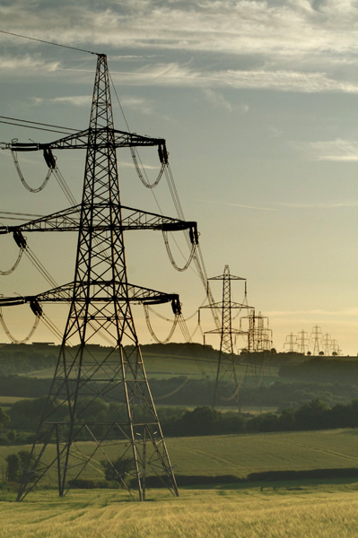
Composition: The power lines lead the eye through the image giving it depth. The lines separating the fields also draw the eye through in a nice curving fluid motion.
Exposure: Depending on the mood you are trying to portray one might say that this image is slightly under exposed. The detail in the middle of the picture is almost lost in shadow. If more detail were visible in the fields the lines separating the fields would be stronger.
Impact: Some impact is generated with the height of the tower in the foreground. I believe more impact could be achieved if more detail were visible through the middle of the image.
You mean those things can be left in the photo? Just kidding. This shot works nicely for the challenge. To bad ya didn't have an even more dramatic sky...
TC
Powerlines are not usually nice to look at in real life, but here they are like a necklace strung across the countryside right to the horizon, it's a good shot.
Beautiful industrial as well as rural imagery. Could be a stock photo. But I also like that you've captured the towers to look like robots ... especially the far ones ... attacking each other. The other thing that makes this photo very effective (at least to my eyes) is the leading line from left to right ... it is very natural for the eyes to follow a left to right line rather than the opposite ... and the fact that the line DOES lead to something (the group of towers at the back). 10.
Wow! Up until now, I couldn't imagine a scene where power liines ADDED to the photo, but this looks really pretty. It's the beautiful farm land, and the way the power lines fade as they travel up and down those hills. I love this! Fantastic job!






 Add photograph to your favorites
 Add photographer to your favorites

 Photographer found comment helpful.


