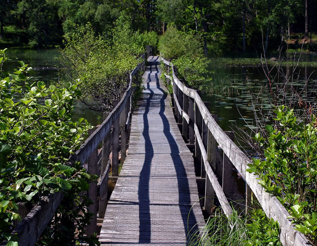
This setting has a lot of potential, and in my opinion, had it been composed slightly different would have been a much stronger image. Be careful about not placing the main subject dead center.
Title is a bit weak, possibly something a little less obvious like Shadow Run or similar.
I don't place any weight in a vote on the title, just wanted to make a suggestion.
Pretty scene! I'm trying to decide if I like the shadowlines running right down the middle of the shot. It's definately different. Is this a location you can reshoot? If so, try putting the camera at more unusual levels like down lower. I know it's hard on the knees, but you can get different feelings from the shot by doing so.
TC
Great focus and exposure, well done considering the bright sunny light, it would be easy to get blown out. A nice pleasing scene. Fits the challenge IMO. ...But, let me preface this next statement by saying, believe me, I am not one of the detail, nitpicky people that over analyze the challenge descriptions and say that the lines have to 'lead' to a pronounced subject. I think the bridge here is the subject and the lines of it lead me nicely through the photo, like I said, it fits the challenge IMO, but as I sit here looking at this image, I hear a little voice screaming that if there were a person somewhere along that bridge, maybe looking out at the water, this could be a much stronger photo. I'm certainly not giving a 'low' vote here, but to me, in this case, that could make for a 'great' photo.
wow - double leading lines - without the wonderful shadows this might be a boring shot but those somewhat undecided shadows seem to agrue with the unstraight railings to convince my eyes to travel accorss the brigde. nice.
Very nicely done. The composition is great and the colors are fantastic. I really like how the shadows line the walkway perfectly. One of my favorites for this challenge. 10
nice idea with the shadows adding extra leading. something looks odd though with the slats in the shadow on the left. ohhhh, breaks in the slats, cloning takes patience grasshopper. i think you could have left the space, it would have broken the monotony of the lines. unfortunately the pic doesn't have much pop for me. perhaps a conversion to b/w would help your cause, as you do have some nice tones.






 Add photograph to your favorites
 Add photographer to your favorites


 Photographer found comment helpful.


