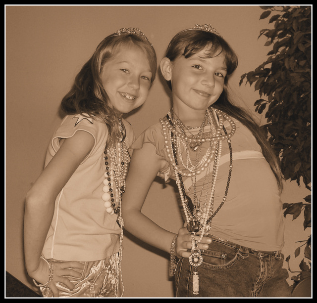
Took this picture at my church with a couple of my little friends.
In paintshop I cropped the original photo and did a one step photo fix which cleaned up the colors for me. I then decided I like the sepia look better so made that change. I added borders and resized the photo.
Statistics
Place: 146 out of 159 Avg (all users): 4.5184 Avg (commenters): 5.0417 Avg (participants): 4.1753 Avg (non-participants): 4.7432 Views since voting: 1140 Views during voting: 395 Votes: 245 Comments: 27 Favorites: 0
Thank for submitting your photo to the DPChallenge, Jewelry Advertisement.
Good candid photo of two young ladies. They look happy and willing to pose for this challenge. The twinkle in their eyes is priceless.There is an good amount of jewelry displayed. The frame is filled well with both subjects. I also see that the girls are both wearing "tiara's". Young princess' posing for you.
Technically the choice of sepia tone is well intended. But it does not show off the jewelry. The sepia tone treatment is an artistic choice, when you want to change the moood of a photo. Something that takes your mind and memories back. For jewelry advertisment is generally does not work well. The color cast of sepia tone down plays the jewelry's brilliance.
The photo effort as cute as it is, works away from the topic or challenge of the photo. The jewelry is not the main focal point here.
It's the kids wearing the jewelry. This image could better serve one of the people or family challenges. Also the two elments on the top right corner, the tree's and another object on the lower left corner are distracting to the viewer. Again it takes away from the reason of the challenge.
Your focus and framing are well done. Overall this submission would not normally run as a Jewelry Advertisment in a newspaper or magazine. You can't really tell what jewelry is being sold. The girls are having fun and I am sure that they would enjoy the final photo print out.
Always think about your subject and how best to present it. In this case it should have been the jewelry and anything else is secondary behind your product.
Ahh...kids being kids.
From a Jewerly Advertisement standpoint, this probably wouldn't work too well with the sepia toning used. Shadows from the flash add a certain element of harshness, but not all of us can have expensive equipment at our disposal.
Thanks for sharing a cute shot, that I'm sure will be far more meaningful in years otcome than just a macro picture of a ring or similar. (5)
the challenge is to make a jewelry advertisement, and while there is jewelry in this photo, it does not look like an advertisement. I do not think this meets the challenge
This is a fun interpretation of this challenge. I like the expressions on the girls, and their poses. I find myself wishing there were more contrast: more white whites and more black darks.
Sweet photograph, but I feel the color tone doesn't work. Two things distract: the leaves on the right and the black triangular spot at the lower left corner.
Nice photo, but it does not depict jewelry in the best light. I don't believe that desaturation is a good choice for representing something as colorful as jewelry. Selective desaturation is OK for jewelry, but would not work here either.
I think this image will get hurt because of the "does not meet the challenge".
Cute pic, but not sure I see how this fits as a Jewelry Advertisement. JMO. Cute picture of the girls - that's one they will treasure some years down the road. ;^)
Cute, but not quite an effective jewelry ad. Should've desat'd all but the jewelry and use BW, not sepia. Cute, though. I'm also going to take a wild gues and say that this was done by LesleyNelson based on this other challenge entry I saw (not sure if the image thing works in comments during voting) Good luck.





 Add photograph to your favorites
 Add photographer to your favorites


 Photographer found comment helpful.