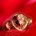
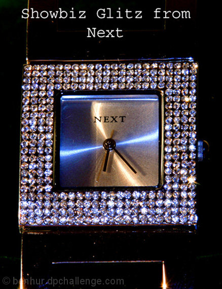
I had a shutter speed of 4 seconds to allow maximun light refration from the diamonds.
Mods:-
Took the brightness down to give the darker back ground and took the contrast up to add to the glitz of the diamonds
Statistics
Place: 147 out of 159 Avg (all users): 4.4735 Avg (commenters): 4.6667 Avg (participants): 4.2300 Avg (non-participants): 4.6414 Views since voting: 887 Views during voting: 366 Votes: 245 Comments: 16 Favorites: 0
The lighting on the left side of the image is creating a distinct line on the edge of the watch and band. This is very distracting from the image overall. Watch face is too blurry and the lettering looks odd as it has lines and background noise in or near it.
Quite an interesting watch with a lot going on here. I might have tried a different angle: (turned the watch slightly to right or left) 1. So it didn't appear so calculated, the crop is tight and the watch face being square gives a boxed in feeling. 2. With a different angle there would be more depth to to the shot and we might be able to pull more detail from the stones on the face.
Also I might have used more light, I don't have a lightbox or tent so I would have rigged a set up with a white sheet and shinned lots of light from both sides through the sheet on to the watch in order to use a small f/stop to obtain focus through the whole shot.
Lighting is a bit harsh here creating some unwanted edge glow on the band that is a distraction in the shot in my opinion.
Image sharpness could be a little higher too, as the "diamonds" seem to be low on detail. (5)
Neat idea, the image has a bit too much blue color cast in it for me. The jewelry piece itself I think could be cleaner - some dust on the band and the face of the watch that would have improved the image if it wasn't there. Good luck.
Odd composition and lighting. Focus is somewhat wrong and kills the sharpness required for so many jewels. Lighting is interesting, but the mix in colours doesn't really work to give this shot the appealing factor it needs to 'sell'. text is dull and not attractive either. 5
The bands showing up in the shot really distract from the whole image. The color isn't very pleasing and almost looks like a snapshot using flash only as a light source.






 Add photograph to your favorites
 Add photographer to your favorites


 Photographer found comment helpful.


