I only have two problems with this picture....
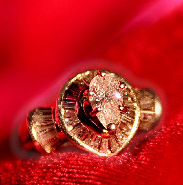
1. the red is a little overpowering
2. the DOF could have been a little deeper to get more of the ring in focus.
Not quie crisp enough im afraid around the stone although great use of DOF here as seen in the material you have chosen to use with some good reflections into the ring off the material. maybe its the light source im unsure but would really love to have seen this a little sharper.
I can tell you had a difficult time with this subject, in comparison to the difficulty I had with mine. This could have used a longer exposure, of course with the proper aperature adjustments. It would have cleaned up the lighting a bit and there is a very harsh reflection of the lighting used in the gem.
This is a bit too closeup for my taste. It might work with a different color background but the red is overpowering and I'm not seeing any fine detail and color in the diamond(s). Some shades of blue work very well with diamonds. Best of luck in the challenge.
Composition is there, but perhaps was cropped in too tight or at 118K, the image was compressed a bit too much. (try and make use of the full 150K when possible, as the image will always look better the less it's compressed) Detail/sharpness is a bit off too.
Not too bad regardless.
I like the idea, unfortunatly, the DOF is awful and the ring is largely blurry and/or out of focus. The Lighting is too strong and washs the ring considerably. With a better sharpening, the reflection on the diamond would've been very nice. The Red colour is very nice and would've done wonders if a better DOF and focus was used. Keep at it! 4





 Add photograph to your favorites
 Add photographer to your favorites


 Photographer found comment helpful.


