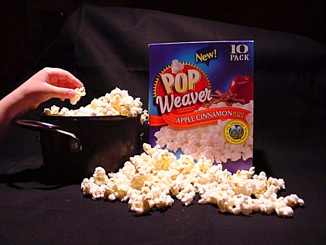
I like the idea (and I love popcorn). The mood set by the photo is great. The picture seems to suffer due to the strong light reflected on the thumb and index finger on the hand, the harsh reflections on the pot handle, and the strong reflection on the top edge of the box. I can appreciate the difficulty of lighting such a scene. The colors do not appear natural. White balance issue? There appear to be severe artifacts from in camera or post processing? The popcorn should be more in focus for my tastes. With all of this said, I still think it is a fine effort, and please take my comments in the spirit of constructive criticism.
Being able to see the creases in and the edge of your black cloth is a little distracting. Also, the popcorn in front is a little washed out, so someof the detail is lost. I like the hand in the picture for some reason. Adds another element to the picture I guess.
I really like the thought that has gone into the setup of this shot. Watch out for the background cloth though ... you can see the folds in your material
Fruit flavours for popcorn? If I didn't know it was apple flavoured, I think those piles of popcorn would look tempting :). I don't know that the black backdrop really works though, especially since the pot that the popcorn is in is also black, and the lighting seems not to have caught the box the right way. My eyes are drawn more to that hand than to the box.
I love popcorn! I like your layout here as well. The only issue I have with this photo is the background behind the box... The wrinkles in the material are slightly distracting from the photo but it's overwhelming at all. Good job!
The hand and popcorn on the left is nicely lit, but the rest of the image lacks good lighting. Otherwise it's an excellent idea, and the framing is good.






 Add photograph to your favorites
 Add photographer to your favorites


 Photographer found comment helpful.


