I want to thank you for the link to the lighting site in one of your comments to someone else. It looks extremely helpful. I appreciate your assistance in growing our mutual craft.
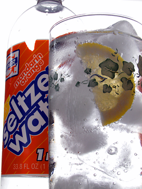
so here's how this came together, and why the ripped label, etc.: at first I only wanted to take a picture of a glass with bubbles and lemon. After taking some shots, I thought it needed something more, though. So I looked in the fridge and there was that orange seltzer water bottle. So I put it in for some test shots, and really liked how it added to the composition of the scene. Then I noticed the label was ripped, but by then it was late on Sunday and I didn't really care that much. After all, it's just an exercise. But yeah, the bottle was added as an after-thought.
I really enjoyed working with backlit transparent objects, and I hope to do some more stuff along these lines in the future.
Since your water is mandarin orange, I might have used a slice of orange instead of a lemon - or maybe nothing in the water, since it's supposed to be so 'great' already, maybe some oranges cut up around the edges and in background?
Cropping could have been better and I am a little distracted by the choice of design on glass. I feel it would have been better if the glass were plain to let the condensation take over.
The glass is very nicely done (althouh it would be better, IMO, with a little frontal lighting to keep the lemon from going so dark), but that bottle... half(?) empty and with a torn label isn't the most appealing.
I like the angle, and the composition. I would have liked a bottle without a ripped label better though, other than that it does make me thirsty so it must be a good ad :>
Nice shot. I think I would have pulled back the tiniest bit to include the top of the bottle instead of barely cropping it out of the shot. I also think an orange slice might have been more appropriate than lemon since it's orange flavored seltzer -- it also would have echoed the color of the bottle nicely. The only other thing is that little ripped out portion of the label.
I like the brightness of this picture. It shows the freshness of the water very well. I think it's disturbing that the bottle is not standing straight though. BTW: it looks there's a piece of lemon in the glass, instead of mandarin/orange :-)
Good photo, good Advert, more "gotcha" appeal than most. Photo 10 Advert 10 Creativity 9 Total 9 (I am pretty hard pressed to give a 10 overall to anybody)
the design on glass is distracting, as is the rip in the product label, the lemon slice is definitely out of place in an orange flavored drink....sorry, this 'ad' has no appeal for me
I really like the ice and the lemon. The leaves aren't clear enough and look out of place here. The product name?? It's not visable and the top of the bottle is cut off. This is a good photo don't get me wrong, just need to see more of it.
This is good. But if you are selling a product I would think the product would be more viewable. Also doesn't look good with part of the wrapper missing.






 Add photograph to your favorites
 Add photographer to your favorites


