I liked the cleverly choosen title too... was one of my top picks. Very well done - Congrats!
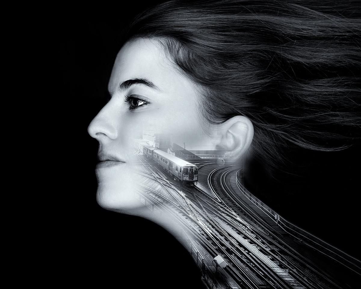
Although I have to agree with riot about the angular look of the fade esp. at the ear.
A strong composition, and an original take on this cliche. I feel the fade around the railway image is a little too squared off and rectangular near the top left. The front lighting on the skin works in some parts of the image, but looks a little too waxy, especially around the ear and nose. Nevertheless, one of my highest scores in this contest.
Such a wonderful idea! The neck of "veins" works perfectly! I wish the ear and cheek parts of the train image were masked off a bit more to continue the awesome job on the neck.






 Add photograph to your favorites
 Add photographer to your favorites

 Photographer found comment helpful.


