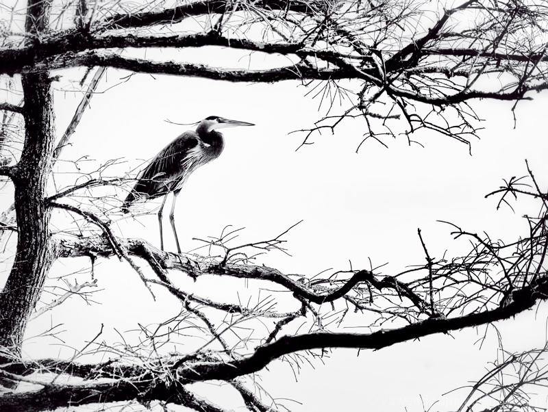
You need to look at this image carefully to appreciate it. Only reason why this did not do as it should have. DPC not the grounds for this to be appreciated but then we post what we like and at least some people can see it for what it is. Great work and scored it 8.
Gritty image despite the apparent peacefulness. This is created by a strong composition and use of graphic elements; a wonderfully appealing and memorable wildlife image.
My first thought was that this was overprocessed, but I normally sorta dwell on the photos I vote on, and I like this a lot more now that I've looked at it a bit longer. For me, this sorta reminds me of the Japanese scrolls of the crashing waves and turbulent sea scenes with the stylized and extreme contrast branches being similar to the exaggerated edges of the waves. Interesting... almost looks like a negative image. A thoroughly appreciated 7 from me.







 Add photograph to your favorites
 Add photographer to your favorites

 Photographer found comment helpful.


