Voted earlier, coming back to leave comments now.
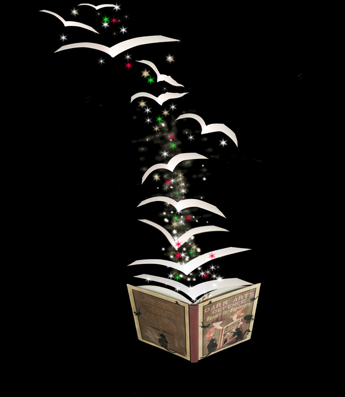
Perfect subject for Magic & Mystery: Harry Potter:-) The idea and effort is good but there are some things that could have been done to strengthen the visual appeal of the imagery. First, is position and arrangement of elements. It is good but can be even better. If you made the book larger to dominate the bottom right corner and then had the bird pages fly off to the top left corner you would have the visual interest of a diagonal 'leading line' for the eye to follow. Stars are a nice touch for it invokes the idea of magic being cast. The pages flying out of the book like birds are both a strength and weakness. Strength, because it adds visual interest and shows the pages magically taking flight. Weakness, because they appear flat & glaringly stark with no shadows or shading to give the illusion that they are there and not just pasted in. The pages should have words or printing on them but again they are stark white making it harder to believe that they are 'there' in the scene. Taking some shots with printed pages and correct lighting in 'v' formation to mimic the motion of flight and position from the book would have helped the composition greatly. |





 Add photograph to your favorites
 Add photographer to your favorites

 Photographer found comment helpful.


