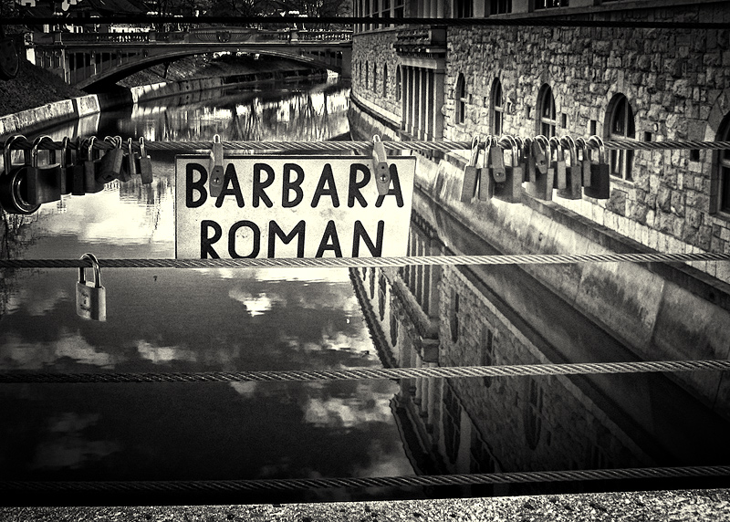
And not a key in sight.
I like this but, unless I am missing something, I find the vignetting on top a bit constraining, which now that I think about it would go well with the concept.
8
Interesting shot but I find the crop a little awkward which leaves me wondering what your intended focal point is. what I mean by that is, I find the sign in a prominent location but not all that interesting, I see lots of locks which are kind of neat but not prominent. The waterway has nice reflections which is cool but they are obscured by the sign, cables, and locks. the buildings are also nice but they got cut off at odd heights leaving the image to feel unbalanced.
Remember it is just my opinion I liked the idea enough to stop and add my 2 cents, hope the info is useful.
I'm going through the entries, stopping at those images I feel have had the benefit of an unconventional eye and dwelling a little longer to try to see and appreciate what you saw. This is one of those images.
Positives: This feels like I've turned a page in an art house photography magazine - perhaps 'Color'. The image is bold, highly communicative but still obscure. We are left with many questions. The toning is perfect and the crispness of the rendition adds much, as does th reflected sky.
Critical stuff: I suppose in the end, the mystery of the image frustrates as much as it it delights.







 Add photograph to your favorites
 Add photographer to your favorites


 Photographer found comment helpful.


