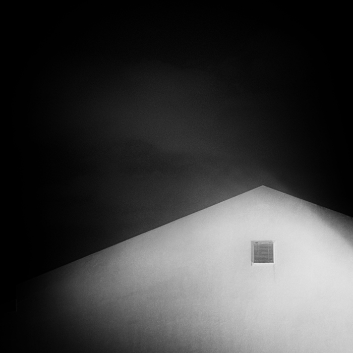
I gave this an 8 but with all the bumping and deciding lost track of it and never commented on it. As well as being an elegant picture, I think it has a sense of humor as well (pathetic fallacy, I know).
Hah! It's always you! 10 from me. If I actually LIKE this stuff so much, how come I don't ENTER stuff like that? I guess maybe sometimes I do, but... not very often... sigh...
I'm going through the entries, stopping at those images I feel have had the benefit of an unconventional eye and dwelling a little longer to try to see and appreciate what you saw. This is one of those images.
Positives: Composition over clarity - I like that. The washed out nature of the contrast, the utterly understated strength of the structure and the (nearly) negative space make for a most effective image.
Critical stuff: Too well balance to suggest any changes - I imagine that if you changed the slightest thing, the whole image would fall apart.
Overall: A stunning example of how an image can be more than the sum of its parts.






 Add photograph to your favorites
 Add photographer to your favorites

 Photographer found comment helpful.