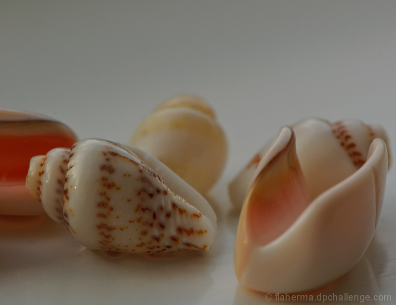
The shapes of shells are interesting, but in this shot lighting is too flat and composition is so-so. Too many different places for my eyes to wander. Pick one area as the subject and then arrange the rest of the elements and the lighting to draw attention to that element.
Very pretty and nice composition. On my monitor, it's showing up rather low key. Wondering why you didn't lighten it up just a tad? It might have brought out some highlights and depth to give it a bit more punch. Hope it's doing well. :)





 Add photograph to your favorites
 Add photographer to your favorites


 Photographer found comment helpful.


