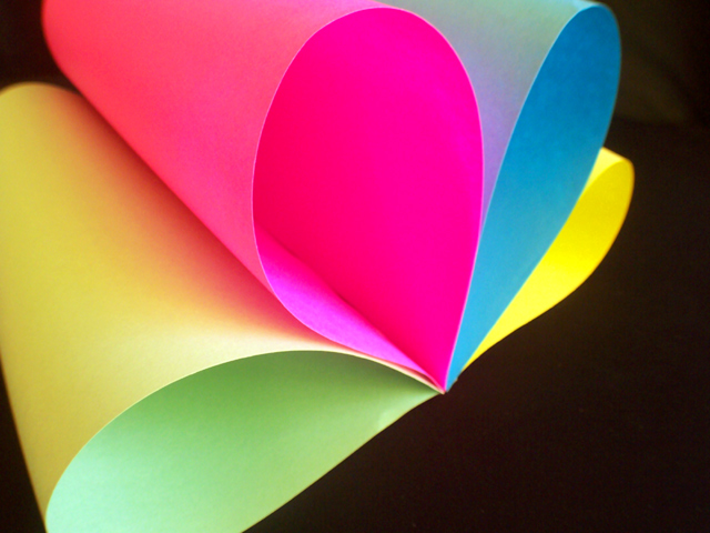
I like how you did the pseudo NBC peacock logo in poster paper. Lovely color and shape combos. Technically well executed with nice snippets of negative space in the corners. Your choice of viewpoint is good even if you had to sacrifice some DOF. The gentle shadows are pleasing and feel appropriate for the smooth curves. This is a personal nit pick but I would like to see a little more breathing space for the pink and blue at the top frame edge. This is a decent abstract image...6
So is this the NBC peacock? :-)
Look at the edge effect on the yellow--that's quite an artifact. It makes it look more blurred than it actually is. In any case, I think it could have used a wee bit more DOF.







 Add photograph to your favorites
 Add photographer to your favorites


