WOW!!!! Super cool shot! Having been the subject of criticism here for a shot with my clothes on, I would never be so brave as to take my clothes off in front of this group... Can I give you more than 10 points for bravery alone????
:: Hello from the Critique Club :: ............................................................
This is one of those shots that defies detailed critique in my opinion.
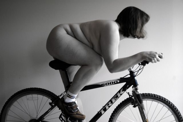
Some valid comments about technicality have already been made below, but suffice to say that this is one of the most memorable shots in the challenge. Its humour is instant and potent, rendering many of the flaws mentioned as secondary.
It's well conceived and as many have said, the model deserves praise for placing herself under such scrutiny and criticism.
A very compelling entry. Thank you for your courage in using a model that suggests the real world rather than the world of glamor magazines. A powerful photo.
I like the way the cyclist seems to be riding toward the light. Nice choice of B&W and the tonal range is good. I have dreams to be an olympian myself. Maybe 2008 I will be ready. Great job.
I am giving you extra points on behalf of your model. I have the same type of body and would have never even considered posing for such a shot. She gets points and kuddos from me for courage and meeting the challenge given to her. :)
Great idea.
I think seeing that the person is immediately in front of a wall distracts a bit.
By using a Black cloth or by adjusting the levels so the wall wasn't evident mas have improved the image.
nice pic, soft focus works, lights great.....just the one shadow on the wall I don’t like maybe she’s too close to the wall and there’s a spot on the wall above the rear tire(or sensor dust?)....I like the shoes and socks too. Too bad you didn’t get the spokes spinning that would have been great
Excellent form!
The image seems a little too soft and the light maybe should have been placed a little further away to even out the bottom left corner and the top right corner. i like that it fades from light to dark, but I think it needs a little more light on the bottom left.
great concept! Would have been really cool if the wheels were in motion. Also, the focus is off on the head of the model, which sort of throws me. I like that you have left a slight colouration on the shot..gives it a little something extra.
returning for comments.
The lighting and pose here is very good. The only thing I would change is the angle, just enough to catch definition of the other foot.
Really love the concept and meaning behind this. The naked body with only shoes on looks kind of weird, but it might seem weirder with them off. (Hey, is that the Colorado flag on there? My homestate. :))
funny, have to keep the shoes on !!!! You could have done some more with the background, for example some olympic rings. The idea is good but the light and color bring this image down for me. 6 for now.
The idea is good, but selective desaturation doesn't really work here. There are some brown and blue areas and a lot of B&W. When using this technique, always think about: What do I want to tell people with leaving some parts colourized, some parts B&W? Is there any additional message of this technique? Here it rather spoiled your photo... though, it would be nice if it was a bit sharper and completely black and white. I would also improve lighting a bit, it's too straight for me... or is it symbolising that she sees the light in at the end of the tunnel? :-)
Very nice. The model, pose, and prop all seem to work very well. Technically I would have liked to see a couple of spots on the background cloned out and maybe a touch more sharpness on the bike itself. Hopefully you do well though. Props to the model and good luck.
I see the idea behind this photograph and I think it could have been very good. Unfortunatly, it is clear in this case that you were limited technicaly and it affected the outcome of the image. Lighting could be greatly improved with proper equipment. the bike could also be different; this one is rather uninteresting photography wize. I'm sure you'll get imamture comments about the model being overweight; personaly, I wouldn't change her at all. I think she's perfect in the photo/concept. Image is too blury (could use lots of unsharp mask in photoshop). All in all, I really think the current photo is the shadow of a great idea you had and you were limited technically. That's unfortunate, but that does not mean it is not good. ;-) cheers! 5
Funny. You've handled the lighting very well. Too bad the bike's not a stationary model (or the back wheel could not be elevated.) This would be better yet with the feet blurred by movement. Nice job.
Interesting shot, a great idea. The sharpness seems way off though, particlularly on the bike, which I would expect to be pretty sharp. The composition, while okay on the bike, doesn't really work for me on the model, as the face seems to occupy an awkward position within the frame. There are some distracting elements in the background that I would have cloned out. I'm presuming there was only one light source, as this has given everything a bit of a flat feel... another light would have been great. In all though, a very creative shot.
Honestly, this probably has the most potential out of the lot. The composition and profile is very strong given the body shape of the subject.
Pose is spot on too and looks ready to burn some rubber. Leaving the socks on just finishes this off and kind of confirms my thoughts of an black comedy picture.
I would dearly love to see this with more contrast and more thought on the background - perhaps black or brick.
Well Done! your model did a great job with form...good straight back, tucked well and has asumed a great riding posture. I like the light source set up and the desat works well here. If I take away a point it would be due to the closness of your background. over all though I like:) good luck! 8






 Add photograph to your favorites
 Add photographer to your favorites

 Photographer found comment helpful.


