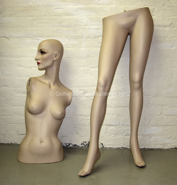
Your lighting is cool, there seems to be a little blue cast, but 1) I'm an amateur who knows nothing and 2) I always assume the photographer meant to do it that way. Nonetheless, I love your unique interpretation of the challenge and it's very compositionally interesting. Kudos to you!!
Choice of backdrop works very well - I like the stark concrete floor and painted brickwork. They contrast with the smooth shiny plastic of the mannequin. Strong composition also.
So much potential here. For starters, the lighting is top notch - not sure if its natural or artificial but i like it. The floor ruins it in my opinion. They don't need grounding and feel they would have been better cropped off the bottom. Also I would like to see the face moved around to be facing her own legs, a bit of comedy thrown in.
This is awesome. I really like the simplicity of the composition. I bet you're getting ragged on about the chipped paint on the bottom but it definately adds to the mood of the photo. There's also a silky quality to the plastic which is great.
A great response to the challenge. I love the elements of this shot. I was going to suggest that the subjects could have been less centered but the more I look at it, the more I like it. Nice job!







 Add photograph to your favorites
 Add photographer to your favorites


 Photographer found comment helpful.


