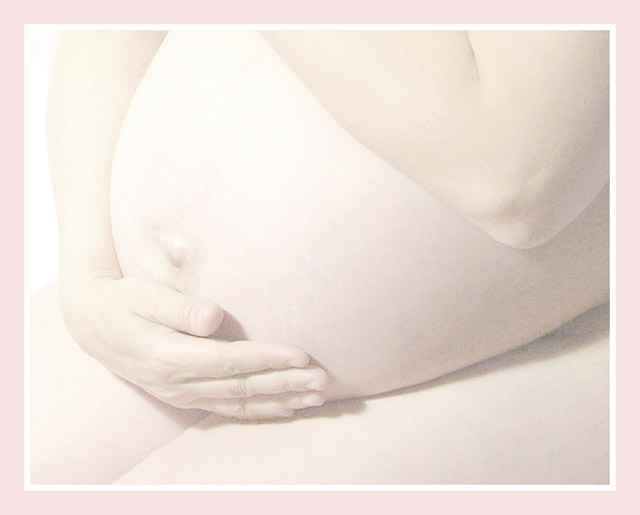
This is a beautiful composition. I absolutely love everything about the view you chose here. The high key nautre of it works fairly well also. I think this is an excellent canditate for black and white because the colors within the image don't work particularly well for me. There is not enough color to provide any significant strength, and the image almost appears monochromatic by nature. The color within the image also doesn't seem to mesh well with your choice of border colors. That particular combination, to me, just feels bland. I think this image, converted to black and white would have a nice gallery quality feel to it if the pink part of the border was also changed to black.
Added: After reading the comments you received, I rememberd that I did a high key 'minimal' image for this challenge as well. That concept doesn't seem to do well here at DPC. The voters here aren't used to seeing it and don't give it a 'chance' to be absorbed for what it is. There are a few who recognize the merit in it, but I was definitely surprised at how few...
this one you need to frame. Such a soft expression of such a time in life to cherish, to remember. For once, the border also works well here, it really adds to the image.
fantastic photograph - but way to light. Needs at least a Little contrast to give some definition. The border has more definition than the photo which can never be a good sign.
Such a shame as everything else - lighting, pose, composition is perfect.
What a waste of potential I see before me - gutted.
Edit: After looking some more i think it would be OK like this if it were not for the border being so much stronger than the image. A nice White would be perfect.
Great processing on this beautiful image. Very high score from me. A personal question - I would have liked just one notch less lightness maybe - but in no way affects my score. You could probably do this many ways beautifully!
Beautiful high-key picture. I love the pink shades used, but the border has been overdone here. A border really should not draw my attention away from it's contents. The noise is a bit high here, I can only presume from a long exposure time. Would it have been possible to light the model better, reduce the shutter time and decrease the noise? Wonderfully posed.
I'm sorry, I don't normally take borders into account when voting, but I think this one is too much of a distraction to ignore. Perhaps if it was the same yellowy colour as the photo and a bit thinner it would be okay? As for the photo, I like the high key approach.
This would be a better picture if it was not so washed out. It looks a little grainy. A women is so beautiful and sexy when they are pregnant. They give off a glow. You should show it. Still good ideal and work.






 Add photograph to your favorites
 Add photographer to your favorites


 Photographer found comment helpful.


