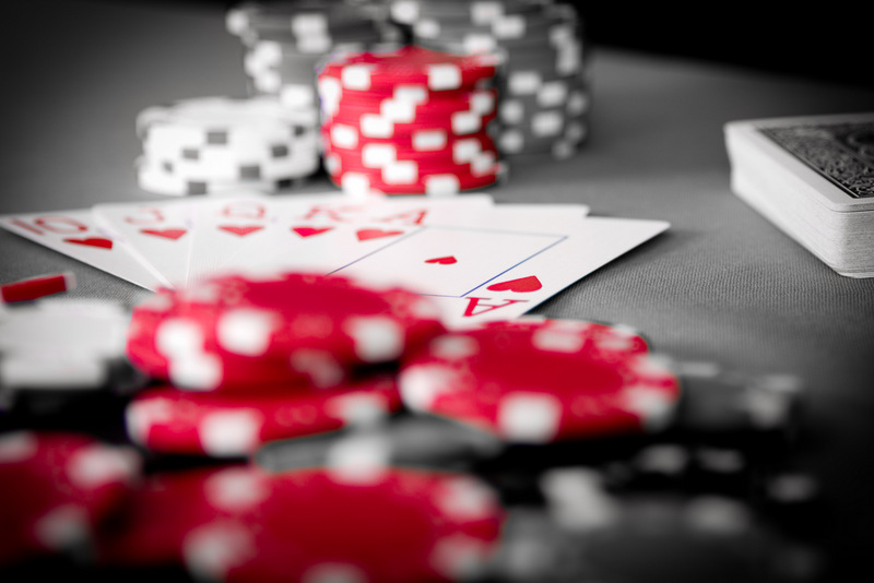
Studio shot, done without a stand-in card table. Image edited in lightroom to remove the other color, and enhance the red in the chiops. Focal point placed on the Lower heard in the hand.
Statistics
Place: 58 out of 123 Avg (all users): 5.5827 Avg (commenters): 6.2222 Avg (participants): 5.7368 Avg (non-participants): 5.4571 Views since voting: 677 Views during voting: 252 Votes: 127 Comments: 12 Favorites: 0
First impression: I like this shot, esp the oof poker chips flanking the cards. But would like to have seen it shot from slightly higher up.
Artistic: The red looks a tad on the pinky side (however I am not at my own computer at the moment), but I find the selective desat works well. I don't feel that the deck of cards to the right adds to the shot very much.
Technical: The crop on the left is pretty tight to the cards; I'd've allowed more room for the cards on the left and cropped in on the right. A more diagonal angle, perhaps from a left corner to the opposing right one, would have made a stronger image. Lighting OK for this kind of shot. The red smudge (meant to be part of a chip?) by itself just below the cards, to the left, is a bit distracting. Your pp is fine and not overdone, it enhances the idea nicely without taking away from it.
Overall: A very good attempt, and score, especially as a first entry here! You're on the right track, just keep shooting and entering.
Sadly, the out of focus red (and white) in the foreground is what my eye gets drawn to, and it becomes a major distraction from anything else going on in the image.
Very effective photograph. Love the colour/B&W you used. Personally I like a little more in focus, say all of the cards, or the top of the cards and the stack of chips in tha back, or whatever.






 Add photograph to your favorites
 Add photographer to your favorites


 Photographer found comment helpful.


