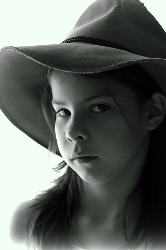
This is my daughter whom I asked to look a little sad for the shot. It’s taken next to a window to utilise the natural light and which was the only light source used. I also decided to add a bit of light-leak effect to image. Both of these may not have been the best choices judging by the comments.
No cropping, little editing and only three shots taken. Less than one minute to set up and take the shot and half an hour of editing (mostly to clone out a hair across her right eye and a couple of marks on her chin and nose. I would not expect this to do very well compared to those with good equipment, plenty of time and most importantly, the skills to take a good portrait.
Oh, and the other two shots? The first was just to try and gage the lighting and my daughter wanted a shot of her smiling. I probably should have taken a few more shots with a smaller aperture to get better focus on both eyes.
[Jan. 3rd, 2012 05:44:31 PM]
Lovely and helpful comments so far – thanks.
To answer some questions:
blindjustice – not formally metered (haven’t got one of those and wouldn’t know how to use it if I did). I used aperture priority and adjusted the exposure time to get a couple of steps down of the camera’s internal exposure metering measurement. I would have tweaked more during RAW conversion but I had lost my conversion software. I took the photo in both RAW and jpg and used the jpg for processing.
pamb – there is a light green tinge to the image. I used a tritone instead of just b&w. I had originally gone for a more brown finish but thought I’d try something different. The more I look at it the more I wish I went with the brown effect. You are not the only one to comment on the washing out at the bottom of the image (and this is probably why I was asked to send in my original). The original shot was already slightly washed out and it was sort of bothering me. So I decided to accentuate the effect. I can appreciate this would not be to most people’s liking but I liked the effect. The photo (not the model – my 10yr old daughter) was not particularly great so the added effect made it just a bit more interesting for me. I haven’t tried this before and if it fails validation it won’t be done by me again. I’m pretty sure I haven’t broken any rules.
Statistics
Place: 41 out of 93 Avg (all users): 5.7908 Avg (commenters): 5.8571 Avg (participants): 5.4808 Avg (non-participants): 5.9505 Views since voting: 814 Views during voting: 306 Votes: 153 Comments: 11 Favorites: 2 (view)
I have 2 monitors calibrated differently and this comes across as greenish on both of them. Was this the effect you were after? Lovely lighting and smooth tonal range. The white vignette is a little off-putting at the bottom - kind of makes it feel like she's floating.







 Add photograph to your favorites
 Add photographer to your favorites

 Photographer found comment helpful.


