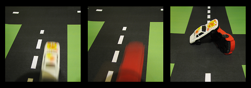
Printed a street layout on a color laser at work, then rolled the toy cars down it during a longish exposure to get some motion blur.
-Tripod, timer, manual mode
-RGB Curve
-Placed, cropped, and scaled pictures into layout in InDesign
-Added black background
-Exported to PDF
-Opened in Acrobat; exported to TIFF file
-Opened in Photoshop
-Resize
-USM at 66%/0.6 dia/TH = 5 (applied twice)
-SaveAs JPEG at quality 10/10 = 144KB
-Save
Statistics
Place: 33 out of 43 Avg (all users): 5.4161 Avg (commenters): 6.0000 Avg (participants): 5.1786 Avg (non-participants): 5.4771 Views since voting: 955 Views during voting: 313 Votes: 137 Comments: 7 Favorites: 0
Nicely done. I love the effect of speed. Maybe if the approach of the white car had been shown in the orientation in which it collided, it would have worked a little better for me, but I' like it and have still given you 8.
I like the "story". Perhaps one of the cars could have be shown to come from "the side", since the accident seems to have taken place on the intersection. As it is now, they both drive in the same direction "at different times" and the accident doesn't make much sense as it is shown.
In the first 2 pictures the lense and/or your head is throwing a shadow which you avoided in the 3rd and probably should have addressed in the first 2. Also the light in the 3rd picture is somewhat "off". the cars look very "flat" in this light and the underside is a solid black without detail.
I do like the way you presented your story on the 3 panels and I like the colour combination. IMO with a bit more attention to the technical detail this would have been a very striking entry.
I like the idea of the two frames of the cars speeding and the final 'crash' frame. I wish the image was a bit bigger though, it could maybe have done with a thinner border, the border is a bit too eye-catching from the subject. The shadow at the bottom of the first two frames is also a bit distracting. Marks for the idea and set-up (cool little road) but execution is kinda lacking.





 Add photograph to your favorites
 Add photographer to your favorites


 Photographer found comment helpful.


