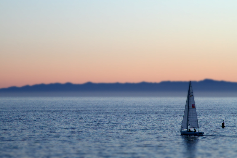
Tilt shift effect achieved through processing, not a lens.
[Dec. 29th, 2011 02:19:16 AM]
So, ummm, why?
I attempted to be DPC correct. I went with the artificial miniature effect. It is in color (yes, my camera will shoot color). It is simple and relatively uncluttered. It is a seascape - unoffensive to all but those with a deathly fear of water.
So, what's the problem? Why is this totally bombing in the challenge? Can a person request to be kicked off this site? Blocked for life? At least a year?
[Dec. 29th, 2011 09:45:36 AM]
This is the entry (well, another one, anyway) that shows that if you do not have the raw talent or skill, you simply cannot develop those things. Eight years. And I still cannot shoot for score.
January 16, 2012
This still saddens me enough to keep me out of challenges for awhile longer.
Statistics
Place: 50 out of 73 Avg (all users): 5.1905 Avg (commenters): 7.5000 Avg (participants): 5.1026 Avg (non-participants): 5.2171 Views since voting: 781 Views during voting: 366 Votes: 168 Comments: 12 Favorites: 0
I really like this! it is a shame it didn't score higher. Although one suggestion... i would have brightened up the sail boat just a little so it stands out a little more. besides that there is no reason it shouldn't have scored better. (please dont give up yet!!)
Deb my only critique is that the amount of forground did not enhance the tilt enough, a better balance and this would have scored very well, the color is excellent.
Don't despair! Go look at my shot if you'd like to see real failure. I couldn't even achieve a brown when trying with a tube of chap stick! I gave this a 7 btw - lovely to look at.
For me this meets the miniaturization criteria but lacks the DPC punch of insane, mad, colours. If this was a fiery sunset this image would be a top 5 but the realistic colours probably look dull to the avg viewer after the colour blast.
I agree overall with spiritualspatula and ShutterRev. While a very nice seascape, it does not have the miniaturization feel that most voters were expecting. A higher viewpoint and possibly more objects in the frame would help on this regard. The smoothness of the water and sky obscure the blurring effect also.
+1, I agree with the comments from spiritualspatula. Not to say it's a bad image, as it is plenty pretty just don't think it has the miniature feel the heavy hitters did. I see this image and the first thing I do is think it has nice colors and is a nice photo of a sailboat, when I look at the winning top tilt shift images i find myself getting close to the monitor to see if they are actually pictures of a miniature model or not because the illusion is crazy, make sense?
To me, the "miniature-ization" is not fully fledged on this one. That particularly look is greatly helped by elevating yourself above the subject matter, and I think that's part of why this doesn't really scream that. No problem with this, but if you're expecting the voters to vote towards that, it could be an explanation.
It's a nice, relaxing photo. I don't think there's particularly something wrong with it, but it's not terribly remarkable, either. I would've figured a solid 5.5 on this one, so I agree that it seems to have come out a bit lower than expected.








 Add photograph to your favorites
 Add photographer to your favorites

 Photographer found comment helpful.


