This will easily be seen as a massive shoehorn, which is quite understandable.
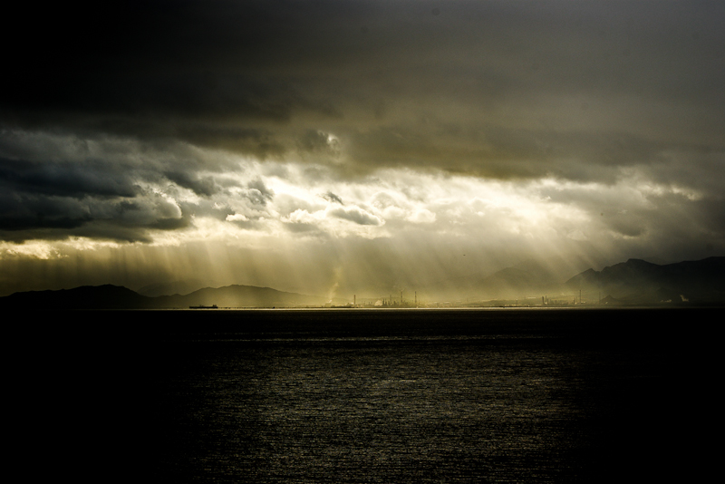
This is the SARAS, a petrolchemical plant now operating in Sarroch (Sardinia, Italy) since around 40 years.
The management granted to this little town a huge boost, tax discounts, subsidized education to university level, full employment in a region with an unemployment rate over 30%.
Since then Sarroch has also achieved another record. A stellar leukemia rate, easily among the highest recorded in Europe.
This closely reminds me of a pattern more common in developing countries, where big corporations' so-called corporate responsibility actions can often turn into poisoned gifts.
I am taking an interest in the trade-off between describing a situation with accuracy and making for an effective image independently on the viewers' background.
Also, I was very interested in a recent discussion on DPC about meaningful photography vs. pretty images, which obviously ended up touching on landscape photography.
So, I took this image thinking how it would be readily interpretable by most people in in my region, but only vaguely so by anybody else.
Then I thought I might submit it for this challenge. It will score very low but I might get some interesting comment.
Statistics
Place: 24 out of 65 Avg (all users): 5.6935 Avg (commenters): 6.5556 Avg (participants): 5.5122 Avg (non-participants): 5.7831 Views since voting: 877 Views during voting: 279 Votes: 124 Comments: 14 Favorites: 2 (view)
First impression: I call this a 'Hand of God' shot, with the beams of light from the dark cloud coming down to light up the giver of these, as you describe them, poisoned gifts.
Artistic: A very good capture of what's going on...but it's all so tiny!! The viewer has to look to find the subject. It looks like a landscape/seascape shot with a petrochemical company thrown in to break up the horizon. The execution is good but the concept is a little bit of stretch. A title more along the lines of simply 'Chemicals and Cancer' may have worked better, and if you had been able to get someone with leukemia in the foreground (or shot them separately and dropped them in)...that could have made it that much more of a powerful image. We're seeing the cause of the cancer but not the effect.
Technical: This being an outdoor shot, you're a bit limited in terms of comp. A bit centred, could have used more thirds, also burning the highlights in the sky would help kill the glare. And the sheer distance from your subject makes it just too small, unless you cropped way in, which might not have been feasible.
Overall: You did get a pretty good score for this image, so well done. Keep shooting and good luck!
Your picture does have the end-of-the-world look and I got the message immediately without knowing the horible story. Yes, the beauty and the beast indeed. The visual beauty of the appocalipse. Very well done. And I must say, the title was not bad at all since it hinted to the real story indeed.
I apologise, I am new to this and you are "stuck" with my comments. Pls. realise that this is *my* learning curve more than yours!
I love this picture, its bautiful. However, I don't think it really does your title justice (or should that be your title doesn't do the picture justice?). Yes, I can see the, I assume, petrochemical plant if I look carefully, but for this assignment I would have brought this much more into the viewer's eye (i.e either different lense and/or different crop). I am not sure how this picture depicts "leucemia" in any stretch of the imagination, nor employment. I understand that you are trying to make a socio-ecological statement, I just don't think this image is able to pull all these things together. Again, as a "photograph" I love it -as it is, especially the monochromatic, but I don't think you really worked the challenge with this image.
The contrast is a little heavy for me on the sea but that sky is beautiful, I like the faint visible coastline of the hills and smoke towers. The image is thoughtfully sombre.







 Add photograph to your favorites
 Add photographer to your favorites

 Photographer found comment helpful.


