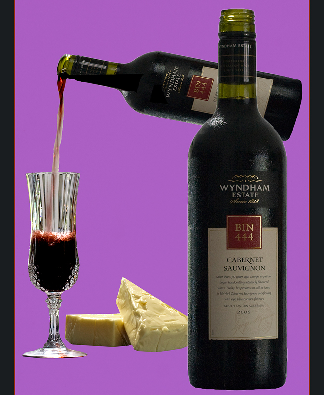
Great idea but the tops and bottoms of the bottles don't appear to be intact and look like they have been taken from separate images and placed here. Overall i like the image and think the background and the border set the image off well.
I apologise, I am new to this and you are "stuck" with my comments. Pls. realise that this is *my* learning curve more than yours!
I like your choice of items and the stylised way you chose to portray them. I llike your color combination. However, I feel the "wine" aspect is overpowering and the cheese looks almost like an afterthought.
The fact that you put together different objects taken with different lighting makes the entire image somewhat unsettled to me. It also sems that you photoshopped the same bottle, just smaller at an angle for the pouring one and edited the "pouring" part in. That in itself is fine, but for me it should be less obvious and with more finess so that an observer does not pick it up that easily.
The cheese and wine floating in a sea of purple looks a little bit strange, for me... there's a natural "negative space" in the centre of the image, and the solid wall of purple gives me nothing to focus on here...
Like the pour shot but mostly it looks bland and cluttered. It needs a set here...a cheeseboard and some cheeses, the wine already in the glass and the bottle off to one side. Here there is far too much going on, and the purple bg isn't working.





 Add photograph to your favorites
 Add photographer to your favorites


 Photographer found comment helpful.


