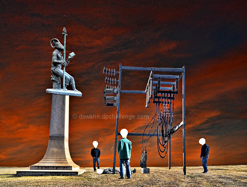
So far this is doing fairly well for my first time trying expert editing. The whole process took a lot longer than I anticipated (masking around that electrical structure & wires was a major pain), so I did not complete all that I wanted to include, plus I had to take some shortcuts on other elements to finish with something submitable before rollover.
Flaws & omissions:
I had intended (as several commenters pointed out) to have the figure that is lying on the ground have a burned out light bulb head. Ran out of time, so I just had to grab a copy of one of the "live" bulbs.
I had a photo of a castle and a small hill that I wanted to use to fashion a mountaintop castle in the distance.
I wanted to have some lightning striking the structure in some manner.
Too much noise in the sky.
Need to dodge & burn to make lighting consistant.
Attempting this project has boosted my already high respect for the expert editing masters on DPC.
Statistics
Place: 9 out of 67 Avg (all users): 6.5285 Avg (commenters): 7.5833 Avg (participants): 6.2619 Avg (non-participants): 6.6667 Views since voting: 1654 Views during voting: 337 Votes: 123 Comments: 15 Favorites: 1 (view)
Congratulations on a strong finish Danny! I think the concept here is awesome and I know you worked hours on this right up until the last minute and couldn't even do all you wanted to do with it. Still, it a great image that people appreciated and thanks so much for doing this one for the team. You have been an awesome hard worker for the team all season long :)
i just realised, the heads are 'pearl' light bulbs, not just abstract shapes. i think they needed a bit of the metal base screw-part showing and/or reflection on globe
Also, the 'victim' on the floor is the point of focus, but would be better if made more prominent in the composition. Also it's not obvious enough he's dead. Perhaps the victim's bulb head could of been darkened, like a burned-out lightbulb, but more exaggerated.
I am really impressed by this image. It maintains photographic fundamentals while still being filled with such obvious artistic editing and vision. The sky is so striking, subjects are clear, and the message is obvious. All of this is done tastefully and correctly, making this my favorite of the challenge.
I really love the concept, very clever! The colors are a bit weird, but they do work together. My only concern is about the noisy background, but I still really like your picture a lot!
just a little stark and cleaned edge for me, doesnt seem to fit togther as an image due to the different levels on ach element but i like the idea and a nice try. 6





 Add photograph to your favorites
 Add photographer to your favorites

 Photographer found comment helpful.


