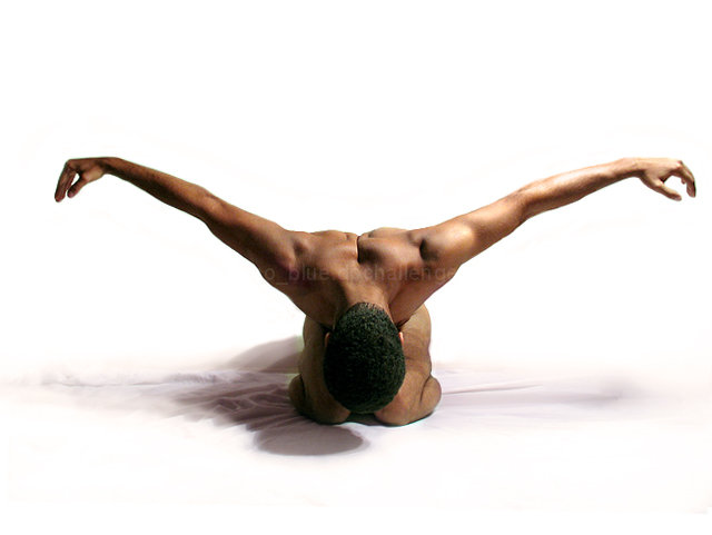
I couldnt get the hands perfectly symmetrical because its a hard pose to hold and my shutter was at 1/10 secs so sharpness was more imporatant to me than symmetry... I took a lot of shots and this ended being the best one, still slightly imperfect but perfect enough for me :-)
Curves,color balance and some masking.
UPDATE - THANKS EVERYONE!!!
Statistics
Place: 3 out of 87 Avg (all users): 7.0259 Avg (commenters): 8.2083 Avg (participants): 7.0886 Avg (non-participants): 7.0074 Views since voting: 21297 Views during voting: 1144 Votes: 348 Comments: 75 Favorites: 33 (view)
It would be pointless of me to make remarks about any percieved technical problems with this shot - you're good enough to get this far, you're good enough to know for yourself what you like/don't like and why about it.
I'm no fan of hyper-stylised posed photography, nor of most studio work, but I have written what I think before on a couple of ribbon-winning shots and got slated for it, so am going to add nothing more.
That's even more impressive - a self-portrait ?! The more I look at your photo the more I appreciate its beauty; after the first surprise about the bird-like pose one sees a balance between the smoothness of the muscles and the pose held - a well-deserved ribbon.
Congrats! You are moving fast, a ribbon in your 4th challange, that's very good, bet it won't be your last. I saw from the Vanishing Point challange that you have great potiental.
Shoot on.
Congratulations on your yellow. Nico, what are you doing here? lol Very good job. I am proud of you because I have read most of your posts and I am indeed happy to find you with a yellow. Break open the champagne !
the shadows and texture ruin this shot for me personally.. you spent all that time blowing out the background to get the contrast between the skin and the background but its all lost when you look at the lower part of the image. lighting to the right is a bit on the harsh side too
Too bad about the folds in the backdrop under the model's knees. Too bad you didn't have a second light source coming in from the left to balance the luminosity on both sides of the body. Great skin tone and good white balance. Well done.
i like the lines of his body, despite the unfortunately shadow (it doesn't seem intentional to me). I also wish for symmetry with the white space on either side of his hand. I think if there was a fill light to the left to get ride of the shadow and also light the right side of his body (the left part of the picture) it would be a more effective shot. 8
This would have been really awsome if the light maybe was right over the subject to cut down on the shadows and the wrinkles of the sheet looks bad..more smoothness
Love it! Compo, quality, all are very excellent. One thing I think I would have tried to change is the shadow. I really love the crinkles in the sheet as well. I can see that some layers curves were used. While the lighting on the right is a bit brighter than the left, thus the shadow, I imagine you were going for something here. Anyway, you look at it, it's a 10!
This is my top male shot of the challemge. The off center crop does bother me but only slightly. You seem to be going for symetry. What I may suggest to increase the impact of symetry is to have even lighting.
Very creatively done..love the white background and the way the lighting has been handled to create shadows which show the creases and folds of the covers..has an almost old fashioned "vignetting " feel to it.
Without doubt the best piece of work I`ve seen in the challenge.
Good luck...10
This image makes quite an impact. The contrasty lighting really defines the form. Its perhaps just a touch too strong for my liking. The highlight on his left forearm is a little distracting and is shown up more by the contrasting shadows on his right arm.(by the way I'm nit-picking here because I really like the image.) I think the crumpled fabric adds a nice touch of softness on the left of the image. Its a well executed shot and there's just a couple of finishing touches that would have finished it off.
beautiful pose and composition. I'd suggest another light source on the left.. but muted, so as not to drown the shadow, which is wonderful, and perhaps a closer crop at the top.
Nice composition, 50/50 about the lighting because of the multiple shadows and harsh highlights on the arm on the right side vs shadow on the arm on the left side. Wish the background wouldn't have those folds. Color and tone balance is good. 8
returning for comments.
Very convincing with flowing lines. My only observation is that the placing of the left thumb should match the other or vice versa. yet the image is pleasant to look at and the lighting is nice.
beatiful. great light to bring out the shape of the body and muscles., pose is perfect symmetrical. Shadows are a bit distracting but I guess that is hard to avoid, I would expect that any lighting that avoids the shadows also reduced the shadows/tones in the body. 9 for now.
I really like this photogragh, position of the model, but am wondering if either more of a shadow or no shadow would be better . . . e.g. having the light behind him so of his ares is in front of him . . . either way I think it's one of the best
A very nice pose - unique and full of tension. But the sheets really bother me. The shadow kind of gets in the way too. I would remove in PS and perhaps replace witha reflective surface?
There are some very powerful and professional shots in this challenge and this is right up there with the best. Emotionally compelling and full of expression. A marvelous photograph!
Oooooh now this is a gem. Wow I had to stop and look at this one for a minute cause its so awesome looking. I love those subtle shadows on the floor surface! And the shape the body is in is so different .. AWESOME






 Mind, Body and Spirit
 Add photograph to your favorites
 Add photographer to your favorites


 Photographer found comment helpful.


