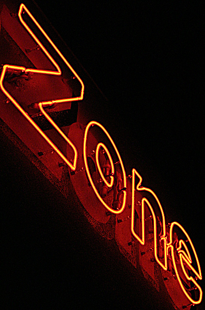
Considered titling this "NONE in the NEON ZONE" because, when I look at it it seems to be an anagram jumble. The title I did choose is just as obtuse without requiring as much from the viewer.
Post process: crop and rotate, levels, re-size, USM.
Predict that this will keep me solidly in the middle of the pack (5 or lower). But that's my new goal--why not? It's easy to attain at the moment and from that I won't be disappointed....
Statistics
Place: 120 out of 222 Avg (all users): 4.8248 Avg (commenters): 4.0000 Avg (participants): 4.5048 Avg (non-participants): 5.0237 Views since voting: 900 Views during voting: 337 Votes: 274 Comments: 8 Favorites: 0
An interesting composition adding creativity to an otherwise uninteresting sign. The angle you've chosen highlights some unusual textures and context that would normally been invisible. Great crop and effect. One of the best "sign shots" in the challenge.
Excessively grainy. The subject (the sign) goes right up to the edge in the upper left and very close to it in the lower right. I feel that there shou;d be some space between the subject and the edge as this current composition feels cramped.





 Add photograph to your favorites
 Add photographer to your favorites

 Photographer found comment helpful.


