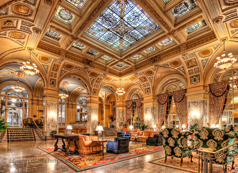
This is the main lobby of the Hermitage Hotel in Nashville, Tennessee. The hotel just turned 101 years old. Really cool architecture. This is a 4 exposure HDR processed using Photomatix Pro 4 and Photoshop Elements 6, with a touch of Topaz Adjust 5 thrown in for good measure. A little over the top I know, but the grand architecture seemed to warrant it.
Post Challenge:
Thanks to everyone for the great comments and PB score! Much appreciated!
Here is a shot of the lounge bathroom at this hotel
Statistics
Place: 2 out of 98 Avg (all users): 7.5976 Avg (commenters): 8.5000 Avg (participants): 7.1695 Avg (non-participants): 7.8381 Views since voting: 14027 Views during voting: 511 Votes: 164 Comments: 51 Favorites: 11 (view)
Hi, just discovered this photograph while looking into hdr photography.
This is one of the most stunning interior photographs i have ever seen,
it deserves first place and has inspired me to start experimenting with hdr.
Congratulations.
Wow...I really didn't think this one would ribbon (keeping it real here lol ;)) just because it was so processed and seemed rather "flat" in appearance because of the processing style that DPCers usually don't like.
Congrats on doing what seemed like "the impossible" with this one. :)
Magnificent!!! Excellent job!!!
I don't get tired of coming to this over and over again. So rich of details... And the warm colours make it so inviting be in!
Congratulations on your incoming blue ribbon! You're out of the league. The detail, light and color is fantastic everywhere in the picture. The only thing missing is Hercule Poirot in the chair sipping tea.
This is getting the only 10 from me in this challenge. I didn't even give any 9s just a couple of 8s. This is one of the best HDR pics I've seen. Congrats, I really hope this gets blue! Where is this?
Very lovely colours. I think the crop is a bit too tight (did lens lens go wider?) Alternatively, you could have cropped the plant on the left, the chair on the right, and the window in the ceiling a bit different.
Has the exact look of interiors from older books on "ameublement", furnishing and easy life. I am not fond of it as a photograph but it's extremely useful as reference.
My pick for the blue ribbon. Great colors, clarity and details. I think this is slightly too bright, but I think it's a function of not allowing enough shadow areas to exist. That said, this is far superior to others in the field.





 5 Star
 Add photograph to your favorites
 Add photographer to your favorites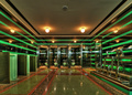


 Photographer found comment helpful.


