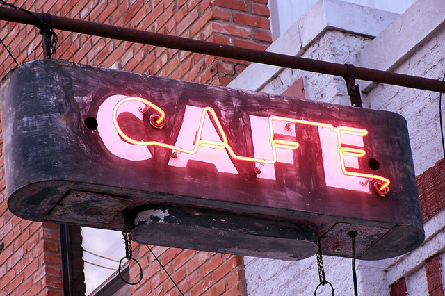
wow i voted a 9 on this photo. i thought it was wonderful. i love the fact that it lacked the glamour of all the other neons. It allowed me to imagine the surroundings and the people that might have been around. i think its great. all the other sign pictures lacked depth, i think you captured something very interesting.
I like the textures and the sense of a worn-out city neighborhood. The background is too brightly lit; it prevents the neon from standing out. Dropping the brightness with curves or levels and upping the contrast would make this a very effective shot.
You have a unique submission, simple and a kinda "old-fashioned" appeal. Although it's well done for this particular challenge (neon) - what would the average non-DPC user say?
Technically - from the DPC viewpoint - it would score MUCH higher if the sign colors were vibrantly red and shouted neon!
The composition is good, background adds the 60's look.
I like the 'grit' of the city you capture in this image. The angle is very nice as well. You chose a good time to go and shoot this neon sign. I am fairly sure this wouldn't have had the same impact on me if shot at night.
Urban feel with a sense of Mom & Pop kinda' place.
Interesting composition - many angles & intersections. Not sure if it helps or distracts.
Possibly a tad over exposed?
I think the neon sign pictures have been done to death; however, this one is exceptional. The details tell me something about the place advertised by the sign. It is more than just the sign. Good Job.
I'm not sure why, but this picture makes me think of Pittsburgh. So it's definately an evocative shot, making me think of a chilly Saturday morning in the city.
Some people might not like the cropping, but I personally like it, and I like the fact that all brightness and vividness has been removed from the neon by taking the shot during the day. I like this one.






 Add photograph to your favorites
 Add photographer to your favorites

 Photographer found comment helpful.


