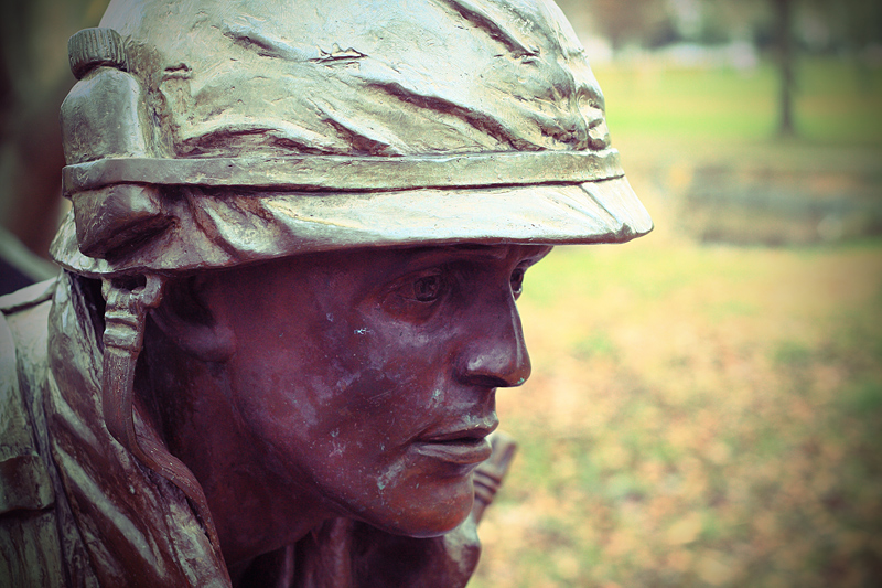
What Art said. In a challenge which required a deeply emotional image, this failed to deliver any. It is a technically clean shot, and well processed, but is emotionally cold.
For me, the background is too bright/lightly colored. I like the vignette and the detail, but all in all it lacked "punch." and could have been more emotive with the inclusion of people. I also gave it a 5.
It is a photo of a statue. I generously gave it a 5 because it is a reasonably good photo of a statue. If I was voting on the statue, I would have given it a 10. It's a really good statue.
It's a nice shot generally (focus, colours, composition, bokeh - all fine) but I think for a challenge like this, people might have been more moved by the shots of real people, people who have seen and suffered war and made it through, real human attachment is powerful in a theme like this. Your photo may be good but even though your subject is a symbol of those that died in war, in my opinion there was no way it was going to compete with shots of real-life veterans and soldiers. I admit I don't quite get (or like) the title of your entry but personally, I do think you should have placed a bit higher.
I did not (cannot) vote but to me 5 is average and this feels like a 5 to me. I think the color is good, it is pleasing in terms of composition, and I like the depth of field -- both the detail in the statue and the softness of the bokeh background. It would take a lot for a photograph of a statue or statue detail to impress me as above average. Just one opinion, but since you solicited comments . . . :)






 Add photograph to your favorites
 Add photographer to your favorites


 Photographer found comment helpful.


