Author Thread Comments Made During the Challenge
Post actions
The banner being cut bothers me
Post actions
Post actions
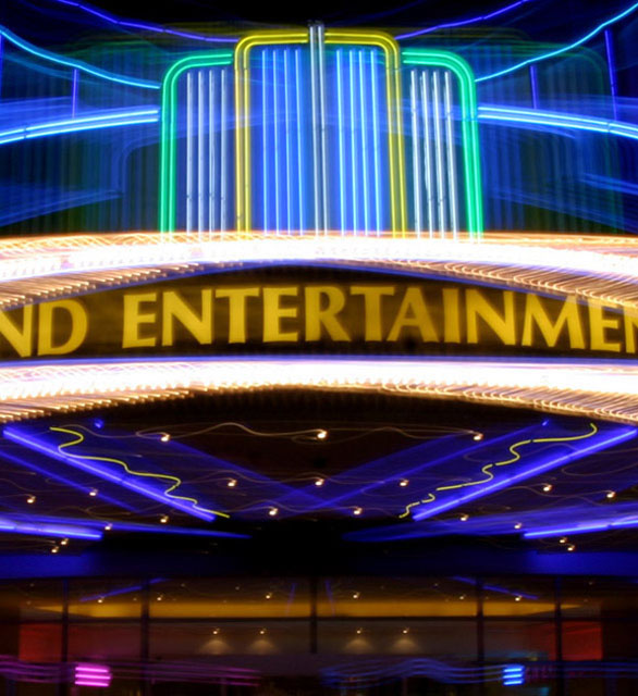
Lotsa neon, but a bit fuzzy in places. A bit confused as to what i am looking at.
Post actions
I like how you blurred the photo. It makes it more interesting.
Post actions
Looks like a bit of camera shake. Laks a place for the eyes to rest.
Post actions
I am left wondering what the rest of the building looked like. I think a step back might have made this more interesting.
Post actions
Post actions
oh not another neon sign! lol
Post actions
Post actions
A little too tightly cropped for me - 4
Post actions
Interesting idea but I can't read the entire sign. I think if you include a sign and it's a major component of your composition, the viewer should be able to see it all. Maybe focus your attention to the lights at the top of the marquee vs the wording of the establishment.





 Add photograph to your favorites
 Add photographer to your favorites


