|
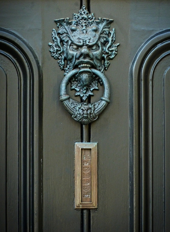
I like how they retro-fit the letter opening into the door vertically! As far as the photo goes I like the nice unobtrusive vignette and the decent viewpoint possibly could have been made stronger shooting more from below. The light is a little brighter at the top. I would have tried to make it more even using a brightness/contrast adjustment layer and masking and blending with a big, soft brush. The light at the top is more blue and cool where it is more warm and dark at the bottom. I think the same concept as above with a hue/saturation adjustment layer or a warming filter could have worked to tweak that too. |






 Add photograph to your favorites
 Add photographer to your favorites


 Photographer found comment helpful.