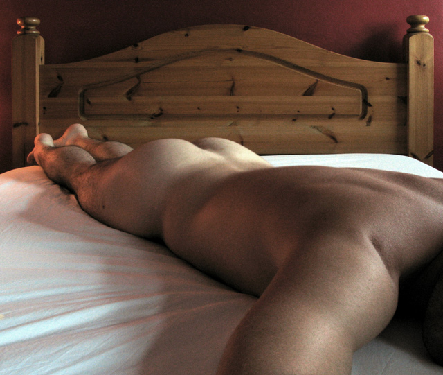
First go at a DPC challenge so I hope I got the submission right. The photo has been auto leveled. Duplicate layer was desaturated and opacity set at about 60%. Perspective to straighten the bed posts and two specks removed with the clone tool. Cropped and resized to meet the requirements. If I got anything wrong, rules wise please tell me nicely. Otherwise I'm happy for any critique on the photo.
Statistics
Place: 69 out of 87 Avg (all users): 4.9487 Avg (commenters): 5.8462 Avg (participants): 4.7215 Avg (non-participants): 5.0147 Views since voting: 4556 Views during voting: 941 Votes: 351 Comments: 14 Favorites: 2 (view)
The colour and lighting work well. This image has a mellow sort of tone. The composition seems to lack a strong focal point. The image does look a bit "chopped off" on the right hand side. The tone and light are beautiful though.
I'm assuming this is a self-portrait, so well done for giving it a go. However, I think the end result here is a bit too snapshot for my taste. The inclusion of all of the headboard and a good amount of the bed gives a bit too much of a 'mundane' feel, and the composition of the bed in the shot feels a bit unimaginative. You exploit the top-left to bottom-right diagonal well, and with a stronger background and better lighting, this would have been a good part of the composition. The light looks like daylight through a single window, and I don't think that works too well here. I would have tried this shot with some lamps at night with some long exposures to play with the resulting shadows.
Kind of an odd pose and point of view. This view doesn't really create much interest (for me) in terms of drama and form. My feeling is that it should have been cropped to eliminate the area of neck and hairy chin which is kind of just cut off at the frame for no real reason.
The composition needs something more.
first thing that pops into mind is to add a girl giveing you a massage.
would also put a bed sheet over the "wood in the bed" (dont know the right word for it)
quite an attractive subject, good choice on the diagonal placement--and nice lighting, as well. although i do like the subtle tones in this, i think i might like to see it in B&W, to highlight your lighting...almost more of a study in lines and form.







 Add photograph to your favorites
 Add photographer to your favorites


 Photographer found comment helpful.


