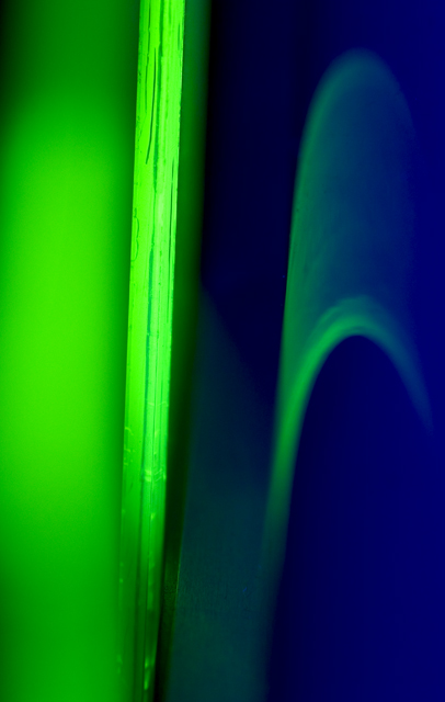
I really like this abstract composition - it's much more clean than many of the other abstracts here, but you also have lots of details in the color transitions.
I don't care for the title, but I dig the abstract nature of the photo. I find myself wanting to know what I'm looking at and not being particularly annoyed that I can't figure it out. The green and blue are strikingly complementary and fit the challenge superbly. What could you improve? Well, maybe make the bright neon green thing perfectly straight up and down. Other than that, it's slightly noisy near the bottom in the darker areas. I really enjoyed this though. 8.
I like the colors, and i think it fit the challenge. I tryed for a couple of minute but I still don't understand what's the subjet! I will read the note. Good work!







 Add photograph to your favorites
 Add photographer to your favorites


 Photographer found comment helpful.


