Critique Club Review:
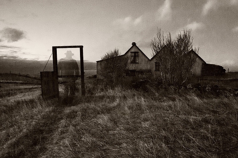
Color Saturation and Hue: N/A image is monochrome. However, the choice here made a stronger image. I believe color would have detracted from this image.
Brightness and contrast: Brightness is well done, as is contrast. Though the detail is lost a tiny bit in the shadows near and to the right of the building.
Focus and depth of field: Focus is very nicely done. Depth of field is deep, maybe a little too much so, for my taste. The subject is the ghostly figure, but the house competes a bit too much for attention.
Subjective: Overall, a very good image. To my eye, it looks like there is a little bit of barrel distortion. And I would have liked it more, if the dark bar did not cut the ghostly figure in two. Still, this is an excellent effort and the top 20 in a 178 entry challenge is something to be proud of. |







 Add photograph to your favorites
 Add photographer to your favorites

 Photographer found comment helpful.


