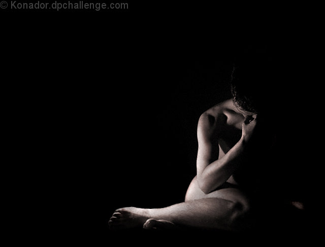
I'm not sure whether there is enough light on the right hand side. I lit my wrist so that you can tell that I'm leaning on it, and it should give a rough idea of where everything else is, but I used a lot of shadows as to not be too embarresed... ummm... I mean... It adds "dramatic effect" hehe :P
Shot with my old G2 so I could use the swivel LCD.
Statistics
Place: 20 out of 87 Avg (all users): 6.2587 Avg (commenters): 7.5000 Avg (participants): 6.3924 Avg (non-participants): 6.2189 Views since voting: 10459 Views during voting: 1023 Votes: 344 Comments: 32 Favorites: 6 (view)
It is a great photo with extreme taste. I like the dramatic effect so the lighting served its intended purpose . more power to the women that encourage us.great for you and great for jodie.should have scored better by all means.
nice moody lighting... i will tell you what i don't like... the bit of something all the way to the right.. i would have cropped it out... also, the top foot looks really blocky and strange. still a good shot
Returning for comments.
This is a classic pose and the selection for sepia gives it more character. There is one minor problem with the angle of the light and its distribution. This is very common with single lights. Look at the knee and the eye receives no help to discern the detail of the joint and the patella. This is solved by gently moving the light slightly about to find the best form. If it is a self portrait then you chalk-up your sitting place and rotate slightly for each take. You may need 20 or 30.
Bumping to 7 because the composition is superb.
Good use of empty space to add to mood. The bit of arm in lower corner is bit distracting I probably would off blacked that out. The hot spots on the arm and leg a bit to hot. An 8
Good composition & lighting. The dark vs light works very well.
Personally I see a slight Magenta cast on the skin tones and wonder how it would look in B&W. Anyway, nice work.
Nice shot, good use of light and shadow. I'm not sure about your composition... I think I would have used more negative space to communicate your subject's sense of isolation. I'd have liked a bit more sharpness.
I like the way this is lit to allow the body to merge into the black background. Excellent use of negative space to emphasise loneliness and desolation.
Stunning and powerful. Everything about this image is wonderful and deeply moving. A very professional look and feel. Oh, to create photographs like this...
Stunning image. The only suggestion I have is to crop closer to the right. The bit of hand(?) seems out of place and disjointed from the rest of the image. I love the use of light and large negative space.






 Add photograph to your favorites
 Add photographer to your favorites

 Photographer found comment helpful.


