|
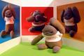
I am amazed that you did this. Or did you? I really like the composition: the focus, the cropping, the placement. Only thing I question is the background color, with the colors on the cube. It seems to steal your site away from the cube. In my opinion black or maybe a soft or light red or blue would have done better. They wouldn't be so distracting. Other wise good one. I'll still give it an 8. PTL |






 Add photograph to your favorites
 Add photographer to your favorites


 Photographer found comment helpful.
