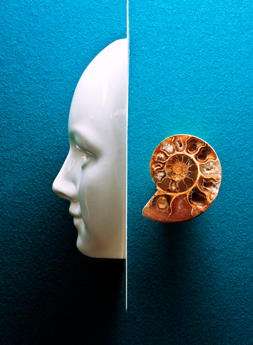
Nice complimentary colours, very clever idea too, although I'd have liked to see a more even spread of light, maybe lit from both sides to eradicate that dark shadow on the bottom left.
I like concept and result. I find the stronger shadow cast by the mask to make the photo somewhat unbalanced (but that just me, really). I wonder how it might look like with a refector lifting the shadow of the shell completely or even with a lighting setup so that the shell's shadow projects upward. That would make for an interesting oblique symmetry. But that's just me overthinking, good concept, well done!





 Add photograph to your favorites
 Add photographer to your favorites


 Photographer found comment helpful.


