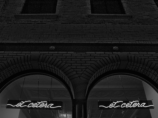
Honestly, if I see one more store window neon sign anytime soon I'm going to hurl ... BUT, I will make a rare exception and acknowledge that I like this shot. I buy into its 'after hours' mood. The repetition in the image (while not entirely your creation - the designer of the display should get much of the credit) is attractive. Your choce of black and white adds very effective emphasis. Good sharpness and tonal range. Meets the challenge. 7
Interesting composition. Like the old time feel of this. Good exposure! I might have panned the camera down just a little bit, but other than that, good job.
I think the et-cetera signs should have been placed at one of the "third lines" if you know what I mean (rule of thirds), but otherwise I like this photo a lot.
I like the contrast, but the center of your pic is kinda featureless... I'm focusing too much on the signs at the bottom. Yes, i know they're the point of the challenge. There's just something about the composition I don't like.
Interesting using black and white. I studied this for a while trying to decide if it truly fit the challenge. I decided I like it and it is interesting and different. Good job!






 Add photograph to your favorites
 Add photographer to your favorites


