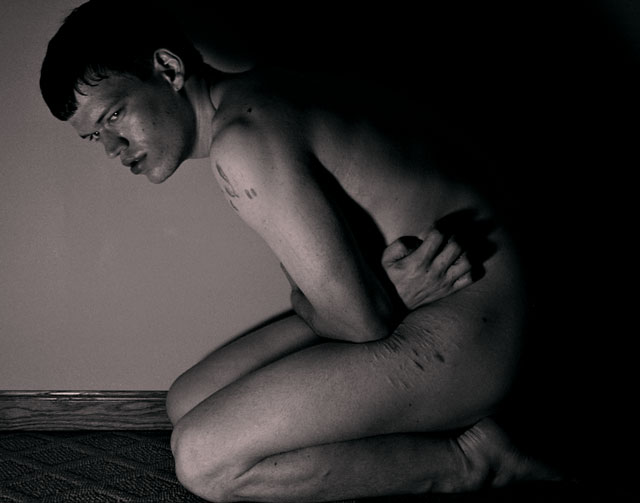
A self portrait. I've dealt with my scars from cutting in a couple of other shots. This shot wasn't really designed to focus on my scars, but given that it was a nude challenge their presence was hardly an option. In the end I decided that they work well with the tone of the picture anyway (not to say that I wasn't mindful of their relevance while shooting) so I decided to embrace their role in the shot with a title that was both literally and figuratively descriptive of the shot.
I hope people like this, as I'm pretty happy with how it turned out.
I figure at least it'll be a lot different than most of the nude II entries.
Statistics
Place: 54 out of 87 Avg (all users): 5.3411 Avg (commenters): 6.5263 Avg (participants): 5.0519 Avg (non-participants): 5.4248 Views since voting: 2851 Views during voting: 811 Votes: 343 Comments: 20 Favorites: 1 (view)
A brave and revealing shot. They say a picture's worth a 1000 words, and this speaks volumes - although it probably leaves more questions than it answers.
Technically, it's a bit of a tight crop and there are some distracting highlights from the skirting board.
wow! there is a brutal naked truth to this shot that really comes thru in the facial expression. I would vote this s ten if the lighting was a bit better & the focus a bit sharper. Regardless gonna bump it up to a 7
This is a great photo because of its emotional impact. It's disurbing, I am sure, because it was designed and executed virtually perfectly to be disturbing. I love the negative space. The composition is powerful. Among my top picks.
This image is very very emotive. The pose, facial expression and lighting combine to convey mental and physical scarring very strongly. The cropping helps too - it's so tight to the edge of the frame that it feels as though he's trapped in a small box and that works well with the theme here. I'd prefer a seamless background - a curved sheet of paper or cloth - which would remove that shiny skirting board and also provide a uniform background.
Quite a harrowing image so ful marks for that. Compsoitiona dn quality seem a little off, but given teh subjectone would expect that and not a perfectly taken image so i think it helps it a lot.
the carpet and the wall siding thingy shoould have been either edited out or blurred down... the carpet seems to have more detail that the face (so im guessing the focus was a bit off). but good idea nevertheless





 Add photograph to your favorites
 Add photographer to your favorites


 Photographer found comment helpful.


