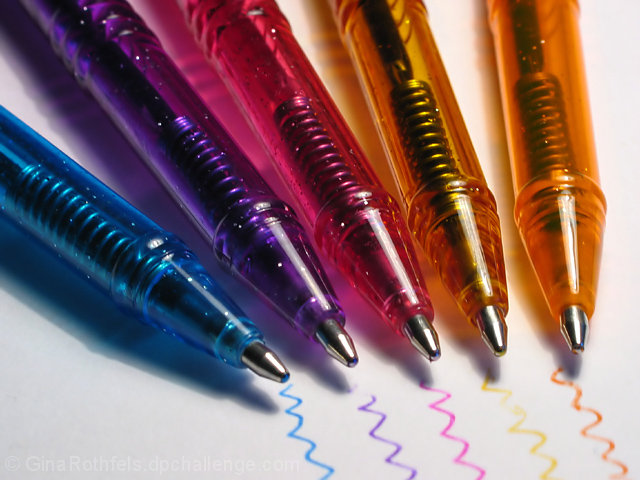
Nice, missing a certain umph to bring it from "nice" to "advertisement..." Maybe some more apparent DOF or something, and a more creative placement of the pens...
I like the idea, detail, colors and composition. I think a more balanced lighting would have worked better. Also you can create nice effects with objects like these with a light from behind.
Creative and colorful.
This shot is screaming for even lighting and a bit more dof to sharpen it up.
Too bad it's an open challenge and no spot editing can be done. ((6))
I really like this idea. Well executed but I'd like to see the other pen strokes extend a bit longer like the blue one and almost touch the tip of the pen. Lighting is fairly direct but it works well here for some reason and I can't explain. Maybe because of the shadow it makes with the blue pen. Lots of little minor details do hurt the score a bit but excellent work. 8






 Add photograph to your favorites
 Add photographer to your favorites


 Photographer found comment helpful.


