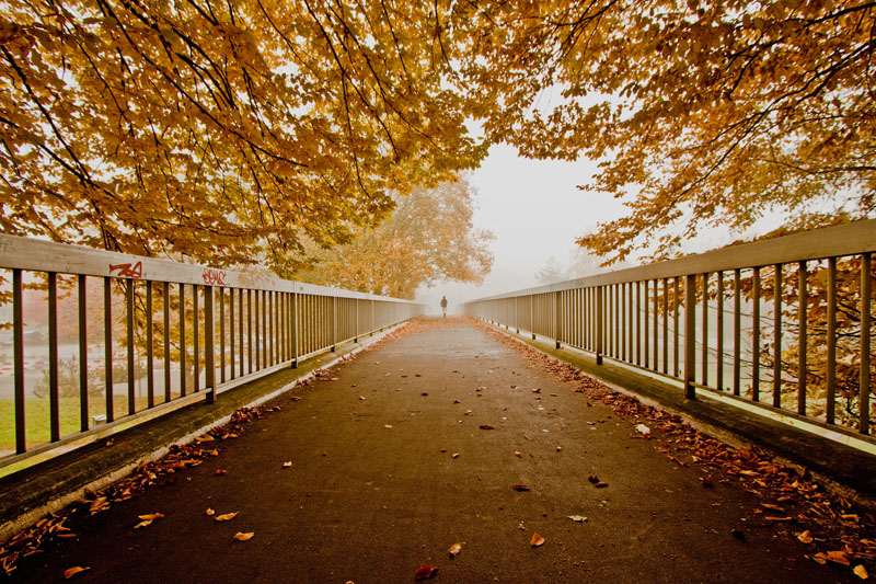
Striking image, and in general I like images with strong patterns and shapes, but for my eyes the railings here dominate the image too much. They lead my eye to a part of the image that is hard to make out and does not appear that interesting at least in terms of foliage.
if the person figure was slight more to the right, the eye would go past and further down the vanishing point? would it be breaking the spirit of the challenge rules if the graffiti was removed? (on the basis of it shouldn't been there to start with) i like the way the trees above appear in composition.







 Add photograph to your favorites
 Add photographer to your favorites


 Photographer found comment helpful.


