Cut back on the noise, focus a little better and bump the saturation (maybe not depending on how good the first two things would make it look) and this would be a lot stronger. 5 - for not taking a picture of a neon sign (thank you for that).
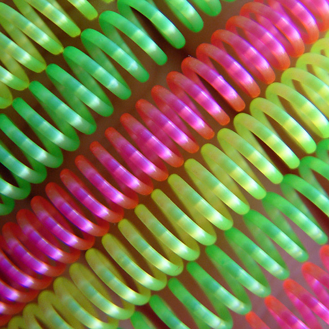
Very nice abstract study. I like the subtle play of light on the coils. Or at least the appearance of light. A second glance makes me think the coils are somewhat marblelized. Either way, it works.
If this were more sharp it would be a great image to me. The washed out color and unsharp lines detract significantly. When composing an image with simpler design elements I think it's important to have them very clear. By simple I mean that you have 6 similar springs as opposed to a landscape, or an intricate flower. Hope this is helpful!





 Add photograph to your favorites
 Add photographer to your favorites


 Photographer found comment helpful.


