Commenting for the critique thread - I see I gave this a 4 in original voting. For a free study I set the bar of expectation somewhat higher than normal and had this been in a relevant themed challenge it may well have been scored 5-6. Also with free study's moreso than any other, I adjust my votes based on the strength of the competition and tend to use the full range of 10-1 so you may have just been competing with a high standard of images that month.
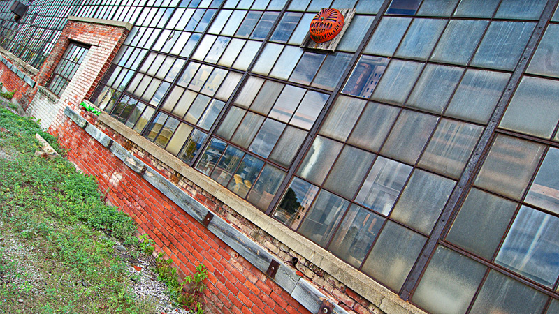
The main issue for me is the leading lines throw my gaze immediately out of the frame to the left, so I have a hard time looking 'at' the image. Maybe being closer to the wall and having the lines go 'into' the frame rather than across it would hold my interest more.
I also found the colours to be a competing distraction - this may really benefit from a high contrast (or HDR) black and white treatment.
I like the angles a lot, especially how you were able to keep the top window almost constant throughout.
I think the windows and the brick facing are gorgeous. The area where I am not sold on is the grass in the lower left. I wonder if a different perspective to only show the building may have had more impact, especially with the geometric focused crop.
To 'show the age' and have the natural surrounds still present, a more standard crop may have been in order. I think you were trying to do both at the same time and I am not sure it worked completely. Still, it got a 6 during voting from me.
although I'm not a fan of leaning thingies.. this works, the part that really attracks me is the story's in the window panes.. I would have tried to crop to the panes.. and maybe you did and it didn't work, but that's my 2 cents... I do love your processing, not too much yet enought to punch it up






 Add photograph to your favorites
 Add photographer to your favorites

 Photographer found comment helpful.


