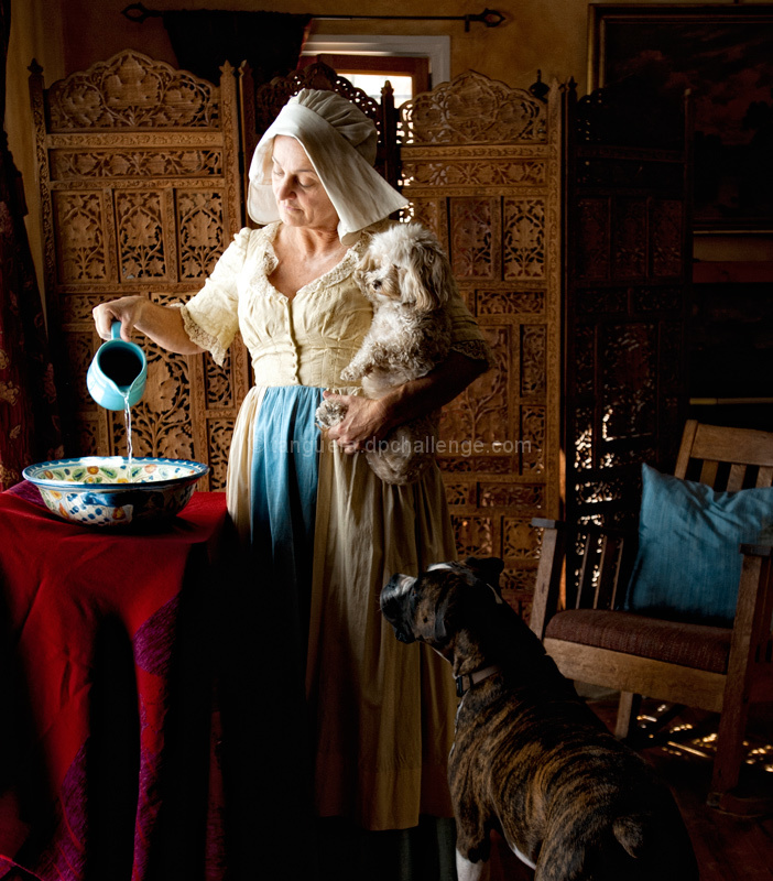
I've been wanting to do Dana's portrait since FOREVER. She is a dear friend, a brilliant actor, and a marvelous model. I also knew I wanted to try a classical setting with her because she just has that sort of look. When I told her I was thinking something Vermeer-like, she practically fainted - apparently, that's her most favorite artist of all time. As she is a costumer working at Warner Bros. - which has arguably the greatest costume department on earth - she was able to pull the wardrobe for the shoot.
Vermeer is know for his marvelous directional natural light, so I wanted to shoot with natural light, but brought my strobes along, just in case. I ended up not using them, but did use a gold reflector to the right, just to fill in a tiny bit on the rocking chair. I knew she had French doors (which I'd envisioned for the shoot), but didn't realize she had a 56 inch plasma TV in that corner - too heavy to move. Fortunately she had those wonderful wood dividers, which served perfectly to both hide the TV and add a sense of period. The rest of the styling was mostly moving clutter out of the shot, finding something we could use as a "table" (a music stand flipped over is under the shawl I used as a tablecloth), and hanging a white sheet across the outside of the doors to diffuse the light. The only things I brought with me were the shawl, the bowl, and the pitcher - the most unburdened shoot I've done yet.
The dogs were a dream to work with. Zeke (the "toddler" boxer) is a total lover, and adores leaning on people. Fluffy (the "baby" mutt) was the most patient little model. As soon as Dana stepped into the shot, they assumed their positions, and I had my shot after the first take. I've never had a more uncomplicated shoot. Naturally, we took several more, and I'll post those at some other time. From arrival to departure I was there a little over an hour.
This is a very special image for me, as it is a transition in my work. I've been wanting to do a series on classic masters imagery, but wasn't ready to give up on my pet portraiture just yet.
Convert from RAW
crop
layer of CEP glamor glow
layer of CEP tonal contrast at 41%
levels
save for web.
[Oct. 19th, 2011 02:14:59 PM]
Mariuca, your eye is unfailing. I was looking for a Vermeer influence, not an exact replica. Plus it was not possible to shoot in the plain uncluttered style of his work - there were too many things I couldn't move. I plan to edit out the back window for the final image, but as this is basic (and DPC), I had to go with what I had.
--
Thank you for all your incredible comments. I knew this would probably get hit hard because not everyone thinks of pets as their "babies". In one of life's many little ironies, one of my best shots on DPC also has one of my worst scores :-)
Statistics
Place: 71 out of 88 Avg (all users): 4.5034 Avg (commenters): 6.3333 Avg (participants): 4.2889 Avg (non-participants): 4.5962 Views since voting: 1289 Views during voting: 353 Votes: 149 Comments: 18 Favorites: 2 (view)
What an exquisite photo! I love the contrast of the wine tablecloth with the wood. The lady and her outfit & tying the blue of her towel, the pitcher, and the pillow.
The only nit-pick I'd give is that the boxer almost blends into the background, and the shot is a bit dark over-all.
Shoulda used in the Free Study (unless you've already got something better there). This is a fantastic image and in the right challenge, is certainly ribbon-worthy.
Very, very ambitious shot. Hard to mark though. I applaud your work, tenacity, humour, fearlessness, photo skills.
Am wondering what Vermeer would think of it.
Do you know the work of Ori Gerscht?
Since I have an inkling of the photographer I can formulate several problems that I have with this picture: you wanted to tell too much and crowded your shot with too many props, the opposite of what Vermeer did.
Hard to crop it but it might benefit from it.
The screen looks a bit cheap and does not match the intention and the style of the foreground. Same for the chair, an almost Adirondack style as far from the subject as it could be. The window in the background should have been obstructed in favor of the central subject.
The woman, dress, position, dogs ... is perfect. But the woman's face does not convey the spectacular serenity of Vermeer's portraits. The background should have been a lot darker.
This being said, I will mark this shot very high since the work and intention is unparalleled. But I do not love this picture since it is too much of a hybrid. Your work and talent is much superior to this shot.
This is a lovely image that I would have given at least a 7 in a free study, but completely and utterly does not meet the challenge for me. Did you accidentally submit it into the wrong challenge? Lighting and subject matter remind me of the work of tanguera. No vote





 Add photograph to your favorites
 Add photographer to your favorites

 Photographer found comment helpful.


