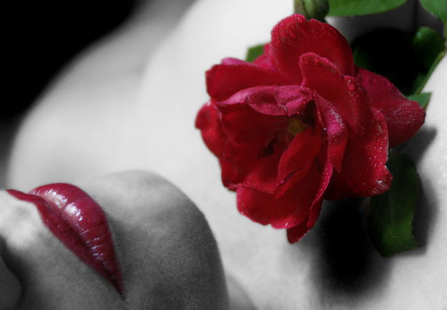
I just wanted to try something a bit different. I didnt want to settle for JUST a flower picture. All natural window lighting, which I think gave it a nice effect. USM, Some burning, levels, saturation. The normal stuff. Thanks to my model for helping out! Great lips, doesn't she? Also, NO BORDER this time since that seems to be everybodies pet peeve! It is a real rose, I misted with water. I took about 500 shots of flowers, and bugs on flowers, and all sorts of plants, but this one DEFINATELY caught my eye out of all of em!
Statistics
Place: 92 out of 215 Avg (all users): 5.5615 Avg (commenters): 8.2000 Avg (participants): 5.2185 Avg (non-participants): 6.1618 Views since voting: 1952 Views during voting: 284 Votes: 187 Comments: 15 Favorites: 5 (view)
Very underrated - I don't know why it got hit in the votes unless they were after some science rather than an interpretation. Very well worked out and shot.
Firstly let em say i hate selective desaturation ;D - but in this scene it is attractive to me for why i do not know.
I think your choice of angle is interesting and enhancing whilst also being creative. Many people would choose to shoot this portrait a turn to the right, but you have opted for a more lying down position which i think really adds interest to the shot.
The reds in my opinion are a little too dark and saturated - but that is down to personal taste.
Focus and grain is good, but i would like to have seen little more detail in the body area.
Overall i feel your final score of 5.56 is about right, if not a little lower than it should be.
One of my top two picks. Although it is stretched a little for the Botany challenge (sex sells I guess) I still give it a 10 for the composition, color and clarity. This shot would make an excellent ad for the rose industry at Valentines Day. Great shot overall!
A magnificent composition. The selective desaturation is brilliant and along with the soft focus and contrasty lighting makes this a period piece (30's, 40's, 50's). Only problem is that I do not see this as meeting the challenge theme. This is artistic as opposed to scientific representation, whiich I believe the challenge is about. Would be a 10 otherwise.
Not at all a bad attempt at a very design-lead stylish image. I think, however, that such very stylised photography requires a bit more PS work to really give it some pop - or a bitt more set-up care. Problems for me are an overall graininess of feel, a sense of wrong colouration on the chin (from those small hairs, and easily fixable I'd have thought), the white marks on the rose, and a feeling of congestion within the image which comes from cropping so very close to the subjects - the rose and the lips. It feels a little lke standing too close to a wall - there is no spcae for the eye to circulate around the image. It has the beginnings of an intersting idea however, certainly - just perhaps needs a bit more definition in terms of light and shape. 6
I am in awe... this is simply stunning. What a beautifully composed, well-lit, and technically well-executed image! The red is amazing. The skin, even with the desaturization, glistens and has wonderful texture. My favorite of the challenge. :o)





 Add photograph to your favorites
 Add photographer to your favorites

 Photographer found comment helpful.


