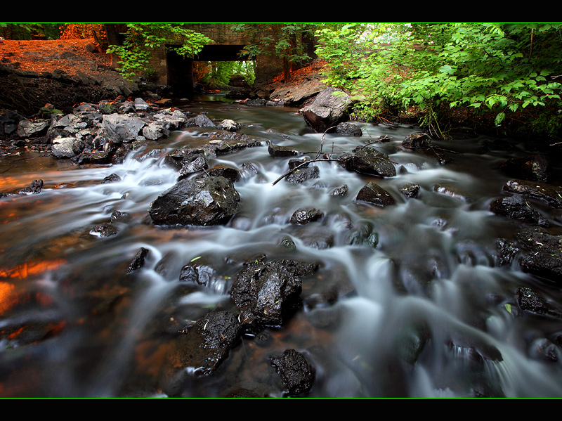
Good finish Rian and a very handy score. I do agree with the comments on the border - perhaps the orange tones would also have added a nice warm feel to the image? I like the comp - the way your eye moves up the water and through the little bridge.
Only one thing I don't like about this... That is the lime green stripe on the frame. I think an orange colored stripe would have worked better (same color as the rock on the top left of the photo). Other than the stripe though this is freaking awesome!
very nice. the silkiness of the water contrasting the detailed rocks creates a nice balance in this. the only thing i don't care for is the bright green stripe in the border, but doesn't affect the score for me.






 Add photograph to your favorites
 Add photographer to your favorites

 Photographer found comment helpful.


