There are three dull pixels on image 7 row 233 colomn 55.55 that are not calculated with the same contrast formula as the similar seven pixels in your image of last year, so they don't match. Shame on you.
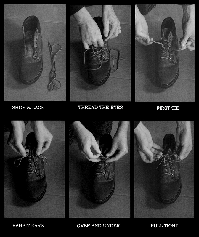
Love the vintage quality of this. Not sure why the top images are brighter than the bottom ones (which also them more visible), but they should all match.
A couple of the photo's are not uniformly processed. The first and third are a little brighter and the contrast is not quite uniform throughout. It could be due to the fact the person tying the shoe blocked your main source of light. You have the directional fill light from the left but the real diffuse ambient light is coming from behind and the person's body blocked it.






 Add photograph to your favorites
 Add photographer to your favorites

 Photographer found comment helpful.


