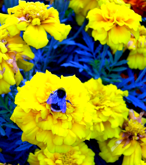
Why the color shift? It looks interesting on the bee but I don't think it works on the leaves. The yellow color is nice. Perhaps more thought to the composition? the flowers with dead petals detract. While the bee is in focus, many of the flowers are not. Why include the top third of the photo? Do those extra flowers add anything? Maybe the bee and the lower flowers would be a better combo?
This seems over saturated to me the blue channel work is so over the top it's distracting. Maybe it's all natural, but if the result of post processing, I'd suggest a lighter touch.
The yellow and blue contrasts nicely - makes for a cartoony feel. Fun - especially those bee wings. The flowers and bee work well for the topic - tells something about plant life, even if the feel is more science fiction than fact! You may find this radical color manipulation to be unpopular with voters. I wish the plants were sharper. I might crop a bit on the top so the viewer's eyes don't travel up there for too long.





 Add photograph to your favorites
 Add photographer to your favorites


 Photographer found comment helpful.


