Author Thread
Post actions
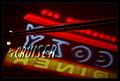
This was one of my favorite sign shots of the challenge. But as I suspected people would comment about the border. Good job, you should try and sell it to them!! :)
Comments Made During the Challenge
Post actions
nice picture. not nice border, though!
Post actions
Nice shot, great angle. Don't think you needed the border. Great picture.
Post actions
I really like the reflections under Hard Rock, great colour and clarity, and an almost flawless black background...just the top of the building (im guessing) behind the "K" keeps attracting my eye.
Post actions
I have to subract one for the frame, its so distracting, draws the eyes away from the sign.
Post actions
border is too large and the colors distract from the photo
Post actions
Post actions
I like the angle you used. Good job!
Post actions
Post actions
Post actions
Post actions
Very nice picture - I think the border is a little distracting though.







 Add photograph to your favorites
 Add photographer to your favorites


 Photographer found comment helpful.


